Case study
Leaph
Reminders that come back, and a record that stays yours.
An iOS medication app for people who take three or more medications a day, designed first for low vision, unsteady hands and constant interruption.
- UX Design
- Accessible Design
About this project
Key results
- accessibility rules set before the first screen
- 37
- bugs caught in testing that nobody had noticed
- 4
- crashes across 17 TestFlight installs
- 0
- on the App Store
- Live
Overview
- The problem
- People who take three or more medications a day mean to take a dose, and then the moment passes. The two apps I studied couldn’t even show what had already been taken.
- The goal
- An iOS app where the reminder keeps asking until you answer, the whole day reads in one look even at the largest text size, and the record stays yours. Never any medical advice.
- What I did
- Desk research on 40 app reviews and 14 videos, a competitor audit, 37 accessibility rules, then structure, visual design and a hi-fi prototype on my own. Testing and a second version with a developer.
- The result
- Leaph is live on the App Store. Testing caught four bugs before release, and version 2 rebuilt adding a medication as four short steps.
The problem
The moment
People mean to take a dose. Then the moment passes.
People who take three or more medications a day don’t forget on purpose. The dose comes at a bad moment. They plan to take it in a minute, and the minute passes. Nobody else is watching, so nobody notices.
My job was to build a routine that doesn’t depend on memory, and to do it without ever telling anyone what to take.
One rule from day one: Leaph never gives medical, dosing or drug-interaction advice.
One missed dose
I followed one missed dose from start to finish.
Using what people wrote in app reviews, I traced the moment a dose is due, the moment it slips, and the next day, when someone tries to sort it out. Each step showed me where an app could help.
- 1On the phone
The reminder doesn’t get through
They stopped hearing a sound they’d heard for months, and an update meant they couldn’t change it.
The app told them to switch to Ringer. They keep their phone on Vibrate, so the reminders never came.
- 2Away from the phone
The moment passes
They got caught up in something else, and the moment went past.
They meant to take it in a minute. Then they forgot.
- 3Later, in the app
“Did I take it or not?”
They forgot to take it, and then forgot whether they already had.
They open the app only to check.
- 4The next day
Fixing it afterwards
Logging saved the planned time, not the time they actually took it.
Fixing a past day didn’t bring back the history they’d lost.
The record stays yours
The biggest theme wasn’t about a screen. It was about trust.
Eight reviews came from people locked out of their own history: a subscription ran out, or a free version disappeared. Nobody was upset about paying. They were upset that something they’d spent months building was taken away.
So I turned it into a rule for the whole app: nothing in the record is taken away, reset or held back, and a missed day costs you nothing.
The goal
Brief
Close the gap between meaning to take a dose and taking it.
The problem
People taking three or more medications a day mean to take a dose, and then don’t.
The idea
If the app asks again, and again after that, until they answer, they take the dose before the moment passes. Memory doesn’t have to bring them back.
How I’d know I was wrong
People switch the repeating off in the first week, or call it annoying as often as they call it helpful.
What success had to look like
- One look
The whole day readable at once
Even at the largest iOS text size, with 44pt tap targets.
- Keeps asking
A reminder that comes back
Until you answer it, from the notification or the app.
- Never advice
No medical guidance, ever
No dosing, no interactions, no “should I take this?”
The promise
A medication record that stays yours, and a reminder that keeps asking until you answer.
My first version led with the reminder. Then I looked again at who praised it: 5★ reviews of the two apps I studied, which already remind people well. The reminder is how Leaph works. The record is why someone would choose it. So I flipped the order.
Scope
I said "no" to more than I said "yes" to.
Anything medical
No dosing, no interactions, no “should I take this?” That includes “When can I take the next one?”, which is a dosing question.
Streaks and badges
A streak has to break, and it breaks on a day that’s already hard.
Caregivers and a website
Letting someone else see your record means sharing health data. Only three notes asked for it, so I left it out.
One cut didn’t last. Stock counts were out at first, because only a couple of notes asked for them. Once I designed the forms, I brought them back: Leaph now keeps the quantity on hand and warns you before a pack runs out.
The process
How each step led to the next.
01Research
I started with what people already say.
- The question
- What do people who take several medications a day actually struggle with?
- What I did
- Collected 40 app reviews, both 1★ and 5★, and 14 notes from videos, then reworked them into 70 typed notes.
- Decision
- Leaph is built around the moment a dose gets missed.
People who take several medications a day describe their routines in public: in app reviews, and in videos about organizing their pills. Those accounts are unprompted and specific, so I built the research on them.
- app reviews, 1★ and 5★, from people who loved their app or gave up on it
- 40
- notes from videos about organizing medication
- 14
- notes in the final evidence base
- 70
- themes
- 22
I stopped at 40 reviews, once new ones kept repeating themes I already had.
What to trust
A theme that comes up often isn’t always a strong one.
This was the hard part. Some notes described something that really happened to someone. Others were opinions, app bugs or advice. So I gave every note a type, and the type mattered more than the count. Rereading my first notes, I also split the ones that held two separate findings. That surfaced six more missed-dose findings hiding under other themes.
| Theme | How often it came up | Evidence |
|---|---|---|
| Did I already take it? | 8 | Usable |
| Locked out of your own record | 8 | Strong |
| It has to keep asking | 6 | Strong |
| How a dose gets missed | 5 | Strong |
| The schedule changes from day to day | 4 | Usable |
| Alerts you can’t switch off | 4 | Usable |
| Sorting the pills out beforehand | 4 | Thin |
| The medication keeps changing | 3 | Usable |
| Getting the details in | 3 | Usable |
| Letting someone else see it | 3 | Thin |
And 12 smaller themes, mostly thin.
Picking the theme
I chose the theme with stronger evidence, not more mentions.
“Did I already take it?” came up more often, but half of those notes were apps breaking. “How a dose gets missed” came up less, but every note described something that happened to a real person, in both 1★ and 5★ reviews. So I built Leaph around the moment a dose gets missed.
02Who it’s for
I defined Leaph by the routine, not by a made-up person.
- The question
- Who is Leaph for, when the research has no names, ages or diagnoses?
- What I did
- Checked what anonymous reviews can honestly tell me, and defined the user by the routine instead of a persona.
- Decision
- No personas. Leaph is for anyone taking three or more medications a day who can’t rely on memory.
Reviews tell you what happens, but not who wrote them: no age, no job, no diagnosis. I wasn’t going to invent those details, so I didn’t make personas. Leaph is for anyone taking three or more medications a day who can’t rely on remembering them. And because reviews show what happens but not how often, I never put a percentage on anything.
03Competitors
Neither app could tell me what I’d already taken.
- The question
- Where do existing apps fail people at the moment a dose is due?
- What I did
- Installed Medisafe and MyTherapy, ran a full reminder cycle, ignored it, then did it all again at the largest text size.
- Decision
- Every dose keeps its state on screen, the reminder can be answered from the notification, and large text is a starting point.
I installed Medisafe and MyTherapy, added a medication and let a full reminder cycle run. Then I ignored the reminders to see what happened. Then I did it all again with the text size turned all the way up.
The day view shows what’s left, never what you took.
In Medisafe, every dose looks the same until you act on it. In MyTherapy, a confirmed dose disappears from the day.
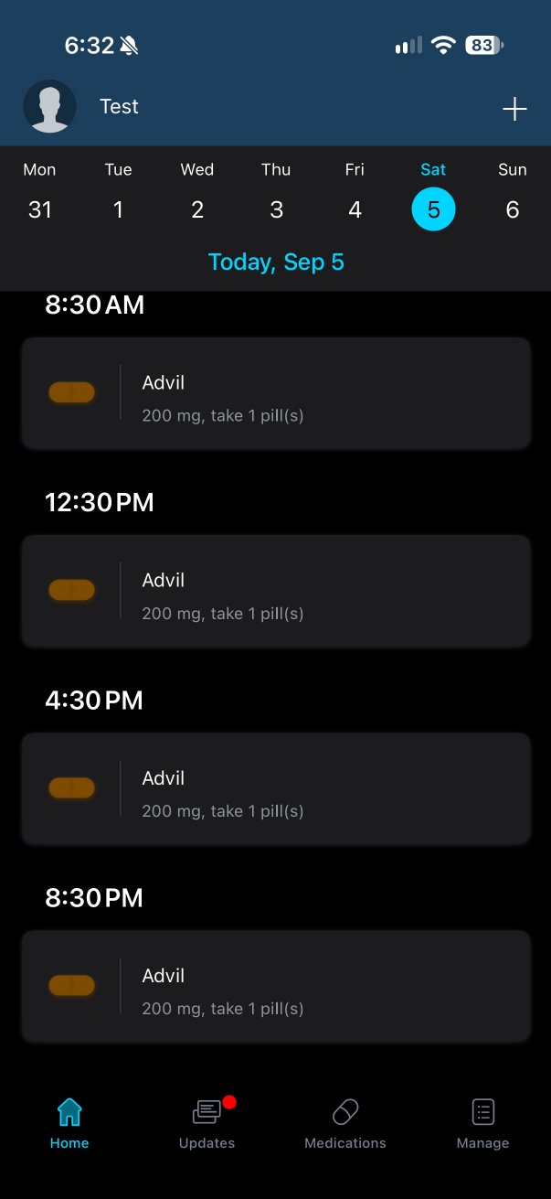
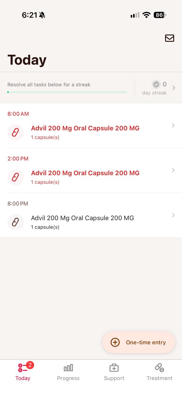
At the largest text size, four doses become one.
Medisafe cuts the time first: 12:30 AM turns into “12…” and Undo becomes “Un-”. MyTherapy doesn’t reflow at all. It clips.
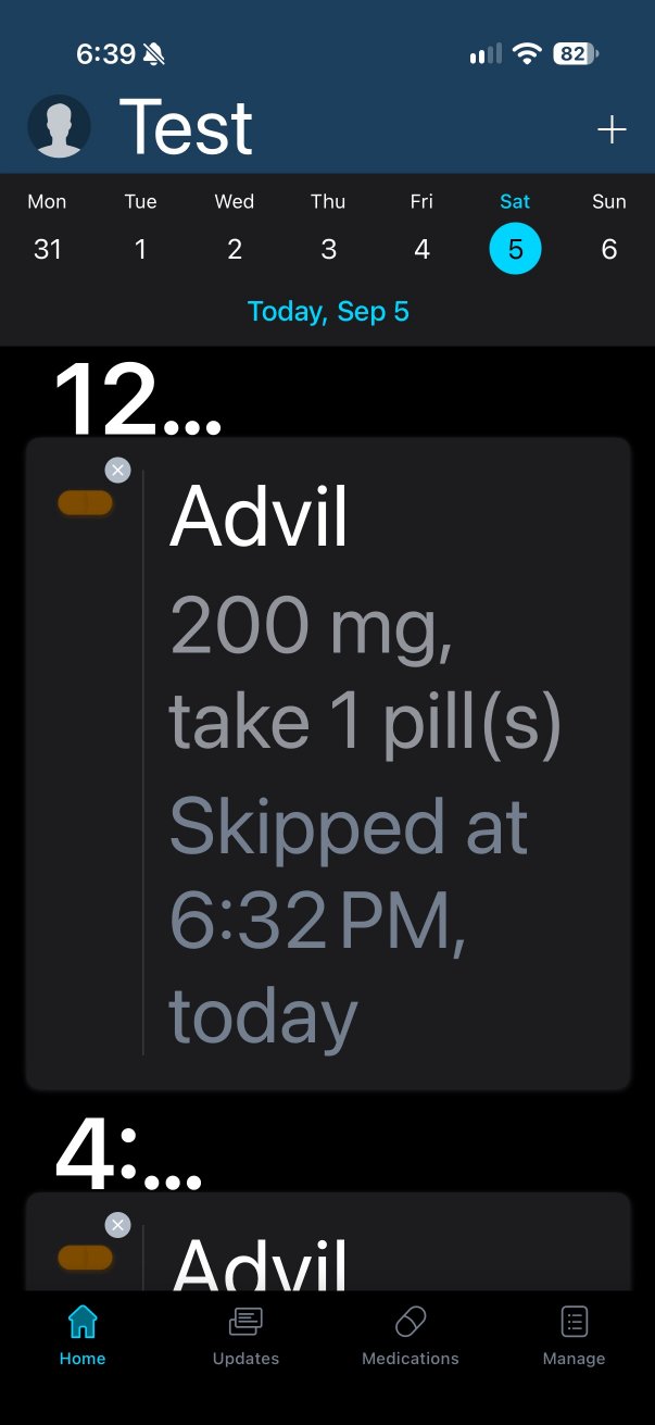
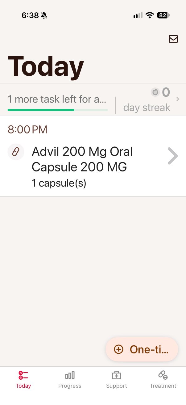
A missed dose becomes something to explain.
Medisafe asks why you skipped, from seven reasons, one of them “Worried about the cost.” MyTherapy shows a streak counter above your doses and an ad on the screen where you confirm one.
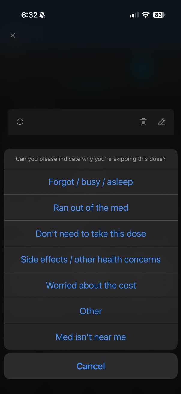
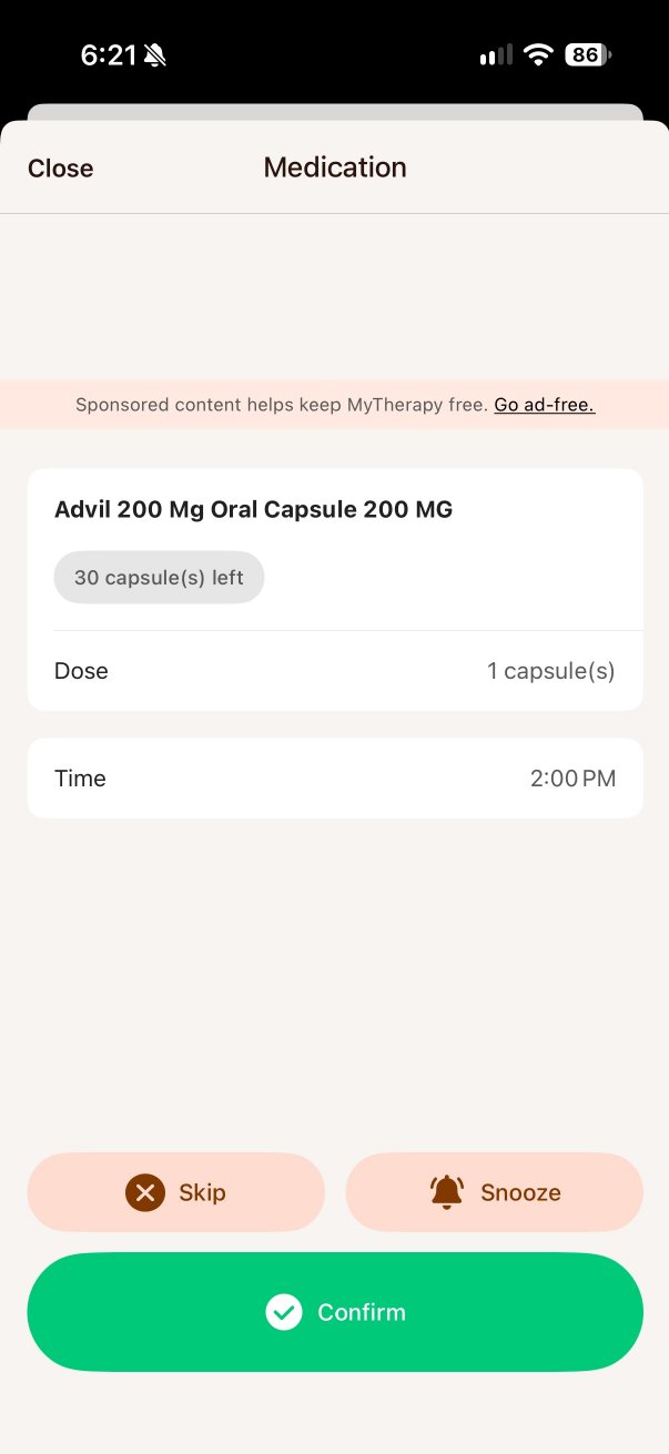
The reminders told the same story. Medisafe’s does keep asking: two more came about ten minutes apart. But every setting that helps it reach you was switched off. MyTherapy sent one notification, then nothing. Neither let me mark a dose taken from the notification, so Leaph does.
No reviewer complained about text size. But people who can’t read an app don’t review it; they delete it. So I treated large text as something the design has to work in, not a setting it has to survive.
04Accessibility rules
37 accessibility rules, written before the first screen.
- The question
- How do I keep accessibility from becoming a final pass?
- What I did
- Wrote 37 rules before the first screen, each tagged by its source: a standard, the research or my own judgment.
- Decision
- The hardest rule led the design: the whole day in one look at the largest text size.
They cover low vision, unsteady hands, not knowing whether a dose was taken, and reminders that don’t get through. Each rule says where it comes from: a standard like WCAG or Apple’s guidance, something from my research, or my own judgment. That kept me honest about what was evidence and what was a call I made.
- 01
One look, at the largest text size
The hardest rule. Big type and 44pt tap targets leave room for very few doses, and the whole day at a glance was the promise.
- 02
Never color alone
Every state is told apart by shape and word too, and everything passes 3:1.
- 03
Three taps log one dose
From a review where one dose showed up as taken two or three times.
05Structure
Flat and shallow, because the screens fill up fast.
- The question
- How should the app be organized when screens fill up fast at large text?
- What I did
- Ordered the flows by how many rules each carried, then drew the information architecture and the task flows.
- Decision
- Four flat tabs, the reminder opens Today, and one dose row is used in three places.
Both apps I audited dropped to one visible dose at the largest text size, so I kept the navigation to four tabs. Today, the main flow, came first: it carried the most rules. The missed dose came next, because that’s what the problem is about.
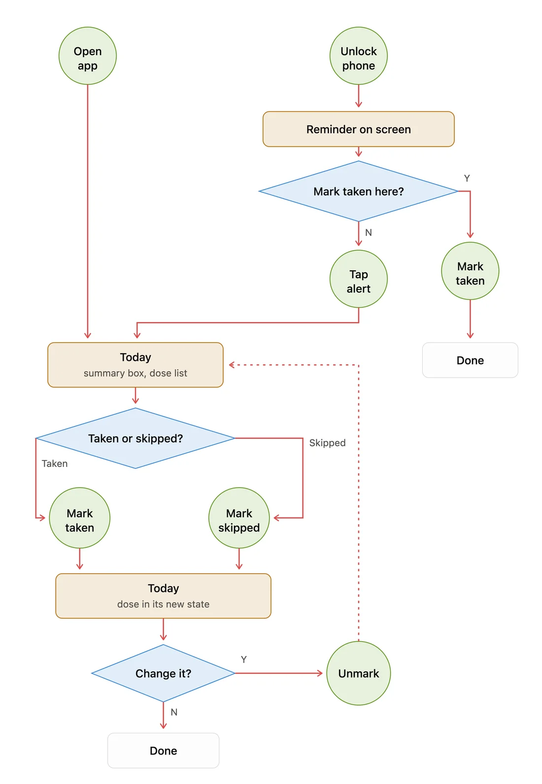
The reminderopens →Today
- TodayOpens first. Mark a dose taken here.
- MedicationsWhat you take. Add, edit, pause.
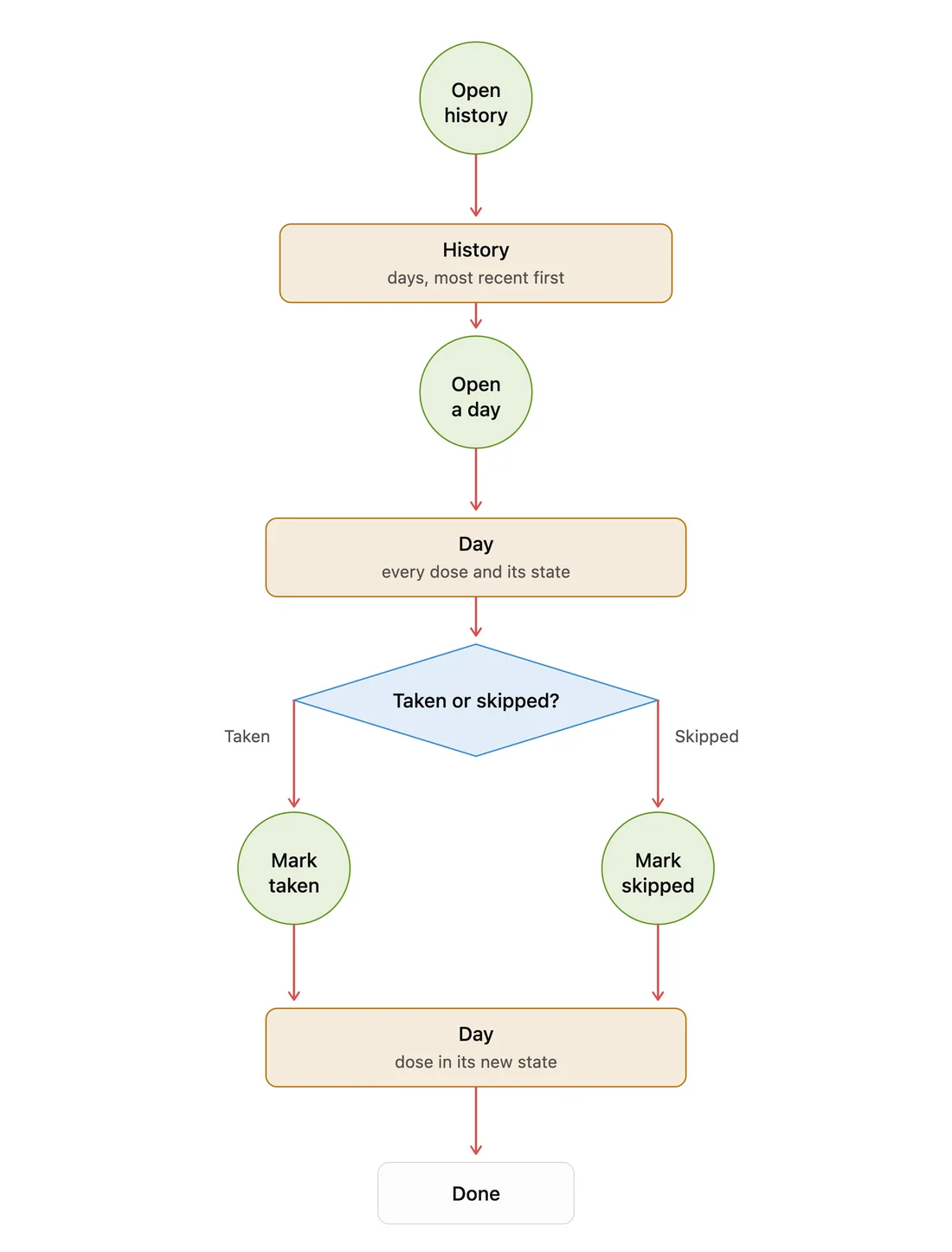
- HistoryEvery past day. Fix a dose here.
- SettingsNotifications, backup and export.
One dose row
A dose can be marked taken in three places, so I designed one row for all of them.
Today, the reminder and a day in History all show the same dose row. Its words and its undo match everywhere, so nobody has to learn it twice.
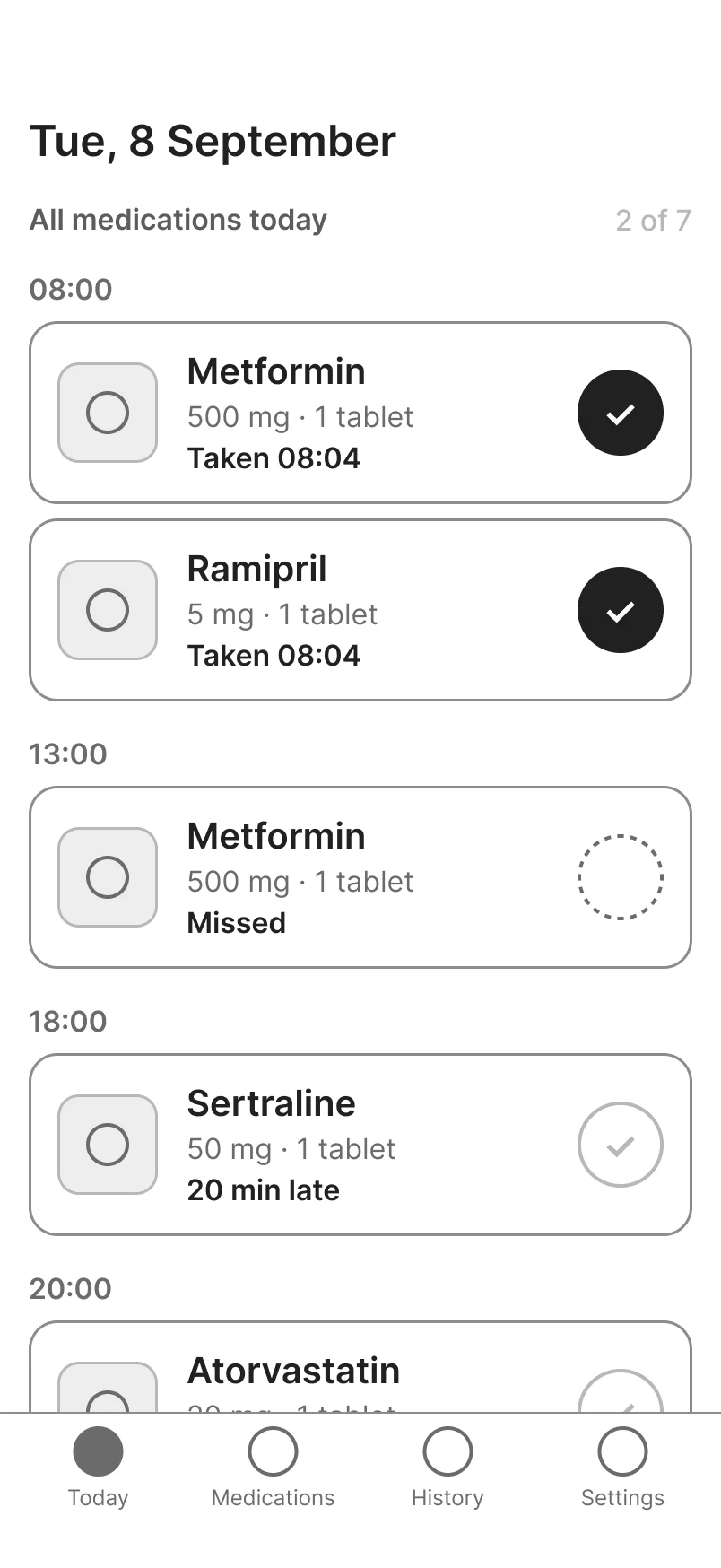
Dose states
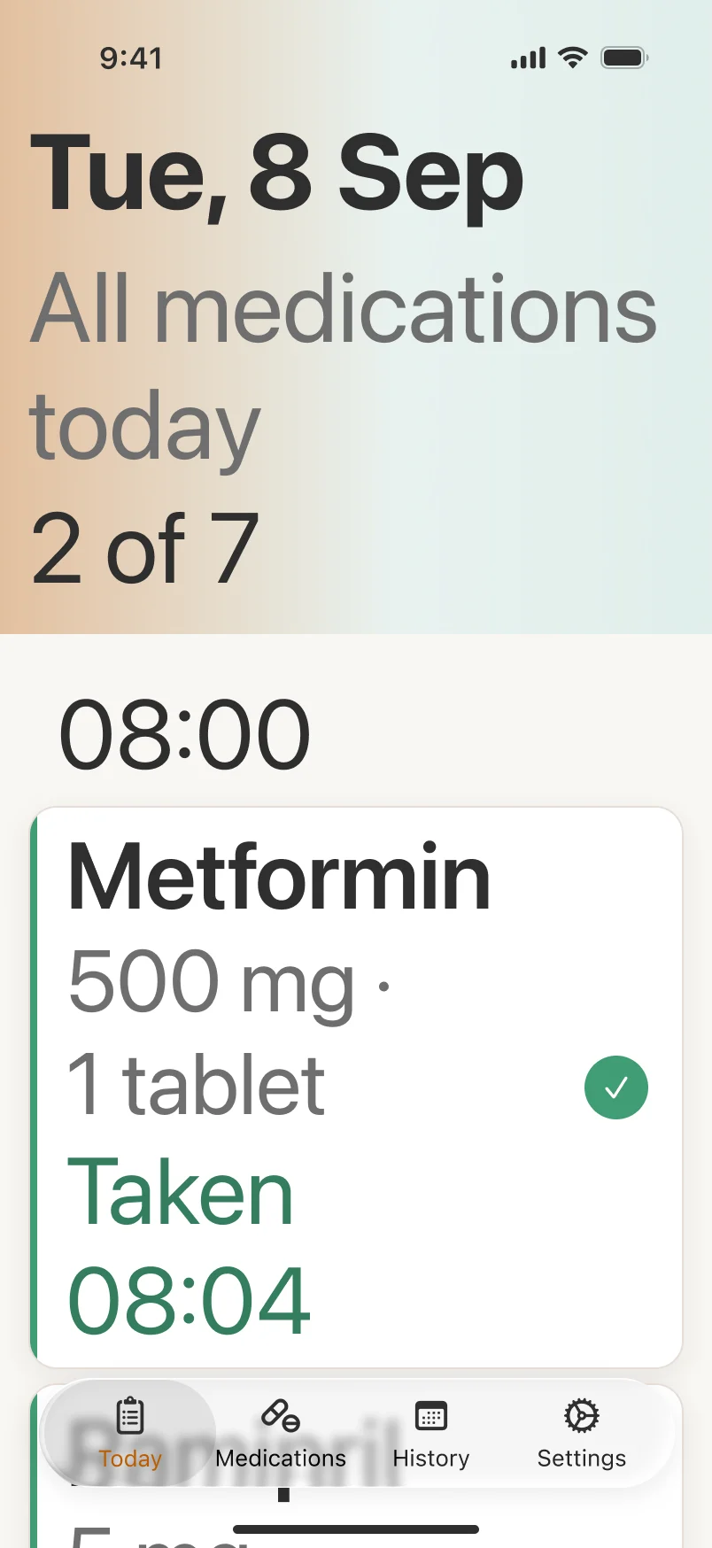
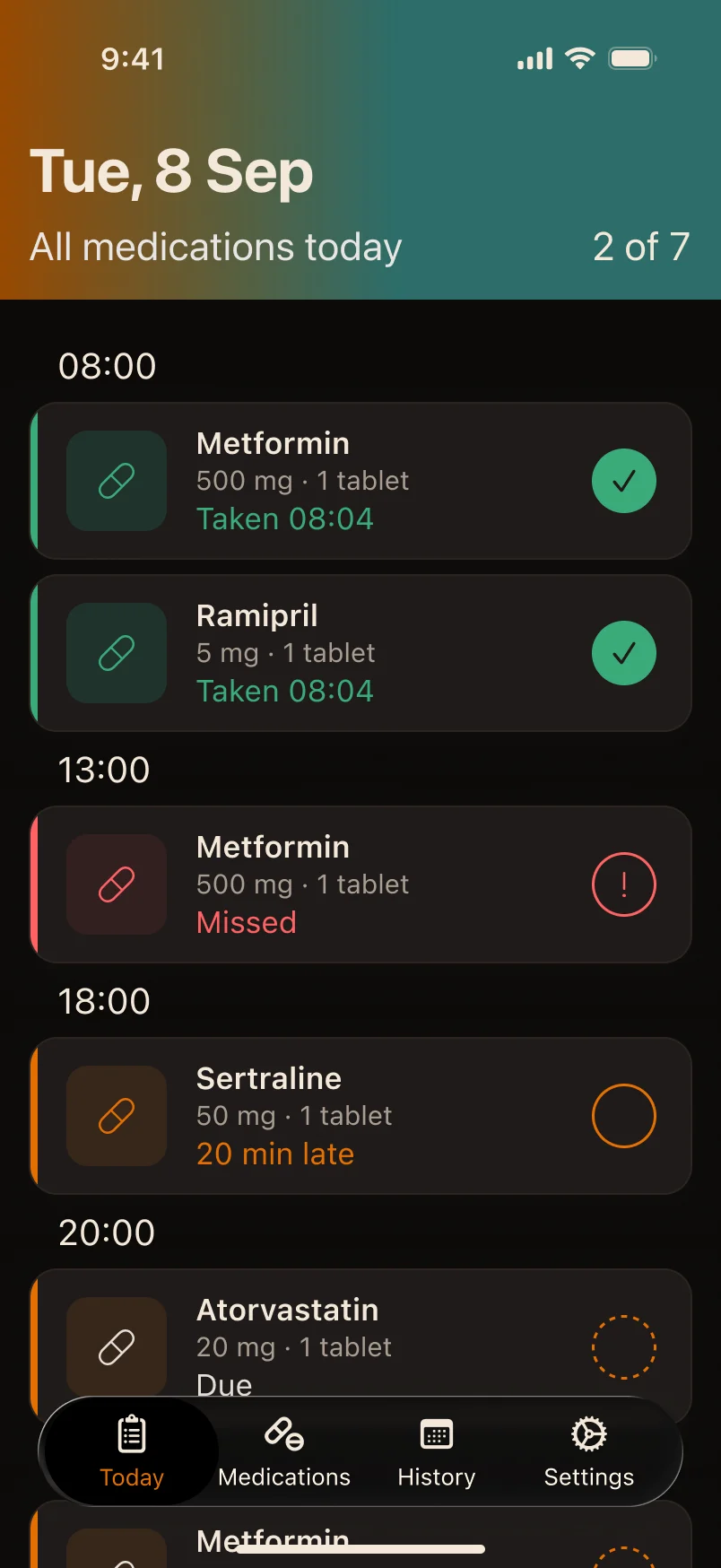
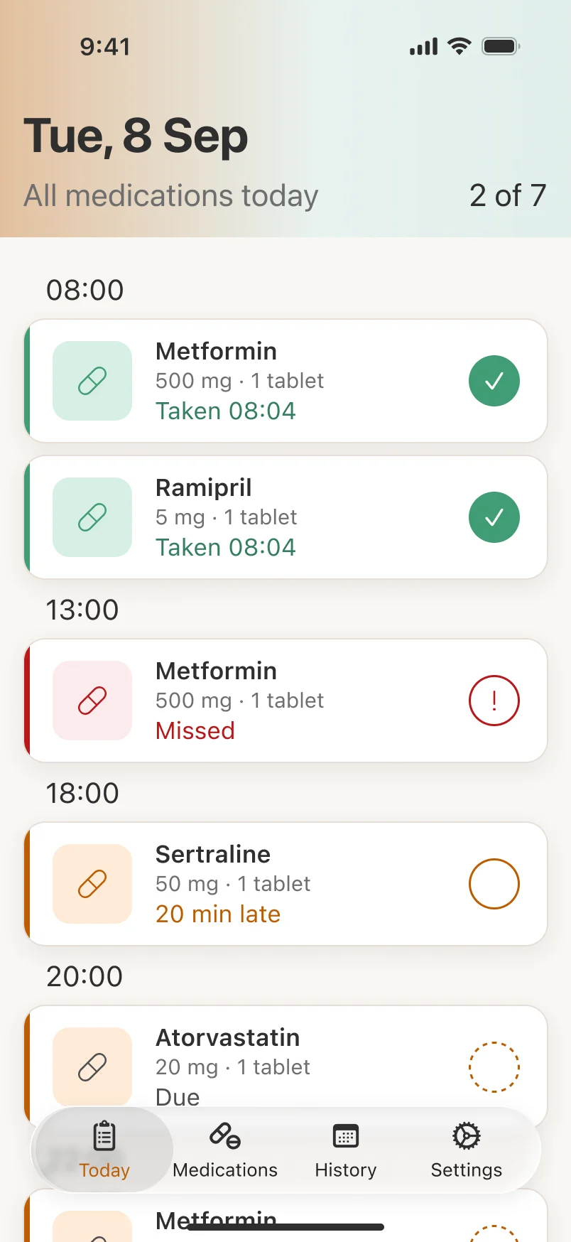
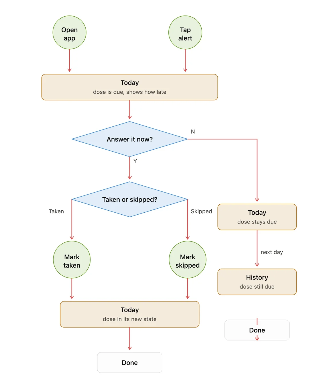
A person can say a dose was taken or skipped. Only the app can say it was missed.
Taken
Set by a person. Happens at once, and can be undone.
Due
Late isn’t a separate state; the app works it out from the clock.
Skipped
Set by a person: “I chose not to take it.”
Missed
Set only by the app, so nobody can record something that didn’t happen.
I chose undo over an “Are you sure?” step. And a dose always belongs to the day it was due: a dose at 00:40 counts for the day before, with a day reset at 01:00 that you can change. Time zones can’t move it either.
06Visual design
Every dose state has a color, a shape and a word.
- The question
- How do dose states stay clear for people with low vision or color blindness?
- What I did
- Gave each state a color, a shape and a word, then tested the markers as drawn, in grayscale, blurred and small.
- Decision
- Missed gained an exclamation mark, and layouts change at the largest text size instead of just growing.
Color alone fails people with color blindness, and soft pastels fail people with low vision. So every state gets all three. Late is a quieter orange, so the whole day doesn’t look like a warning. I checked every color instead of trusting it.
Taken
Sage, with a checkmark. Still told apart from Missed with color blindness.
Missed
Brick, always with an exclamation mark.
Action
Orange, used only with pure white text, where it passes.
The blur test
When I blurred the markers, two of them became the same.
I tested the markers four ways: as drawn, in grayscale, blurred and small. In the first version, Missed and Due differed only by a dashed outline, and under blur that difference disappeared. I added an exclamation mark to Missed, and it held up.




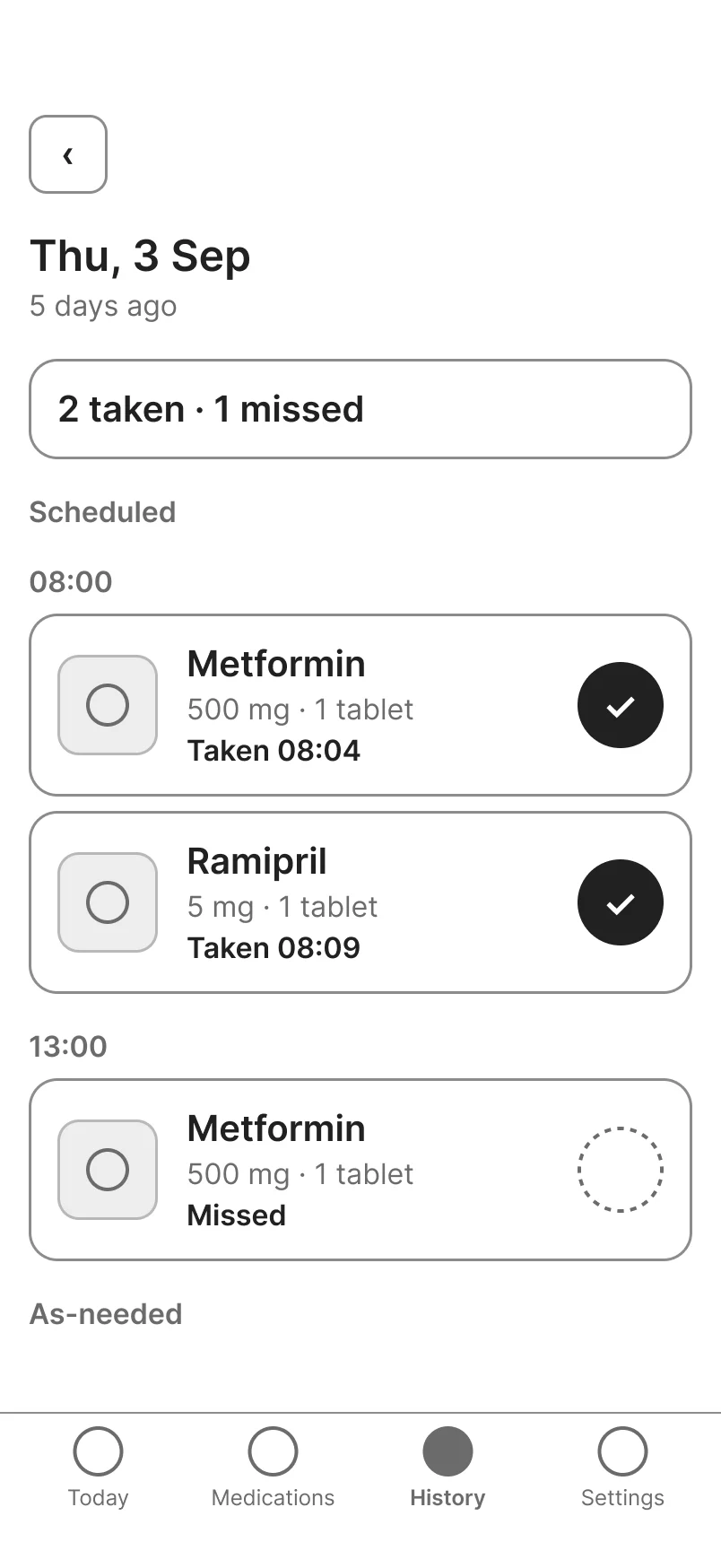
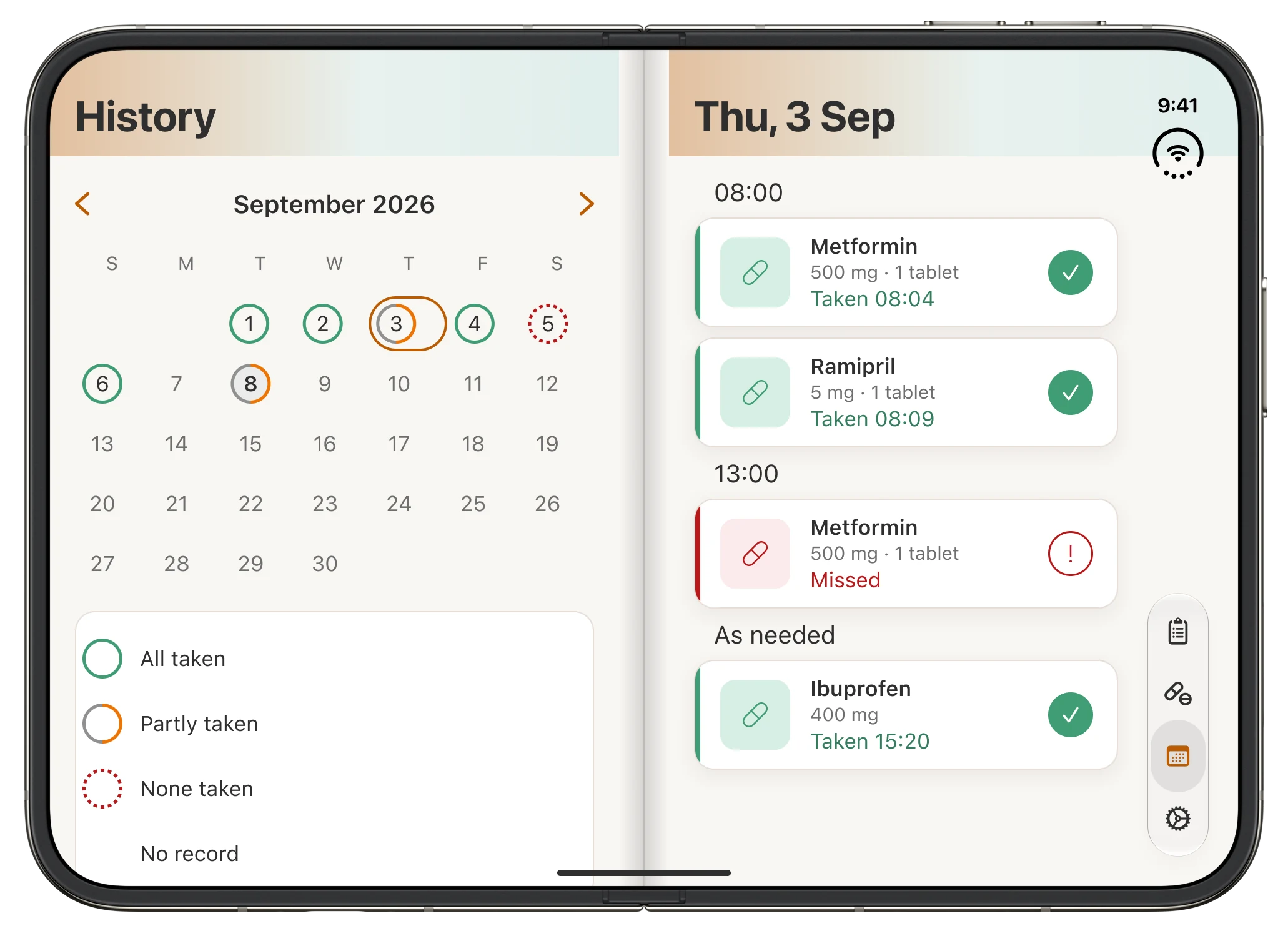
History uses the same idea. Each day has a ring: solid when everything was taken, half when part of it was, dashed when nothing was. The dashes mean red and green are never the only difference.

Largest text size
At the largest text size, the screen changes instead of just growing.
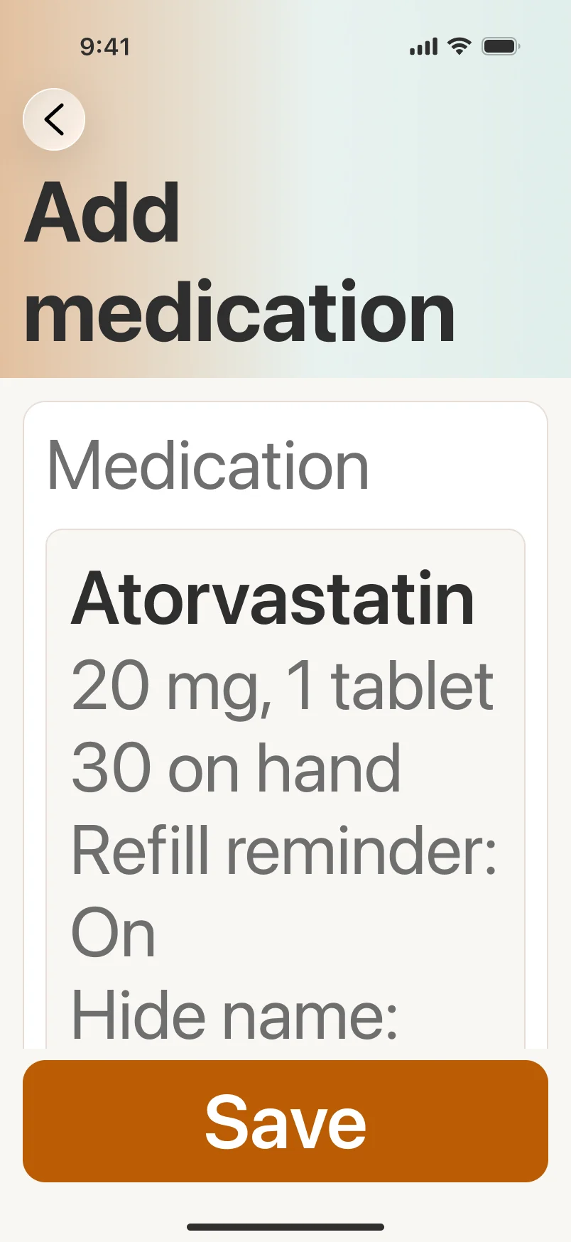
The hardest rule was keeping the day readable in one look at AX5, the largest text size iOS offers. I solved it in the layout, not in the styling. The tap target stays at 44pt and the extra width goes to the medication name. The summary at the top stays readable while the doses scroll.
In History, seven calendar columns don’t fit at that size. So the month becomes three columns, with the weekday on every day. Nothing is lost; the layout changes.
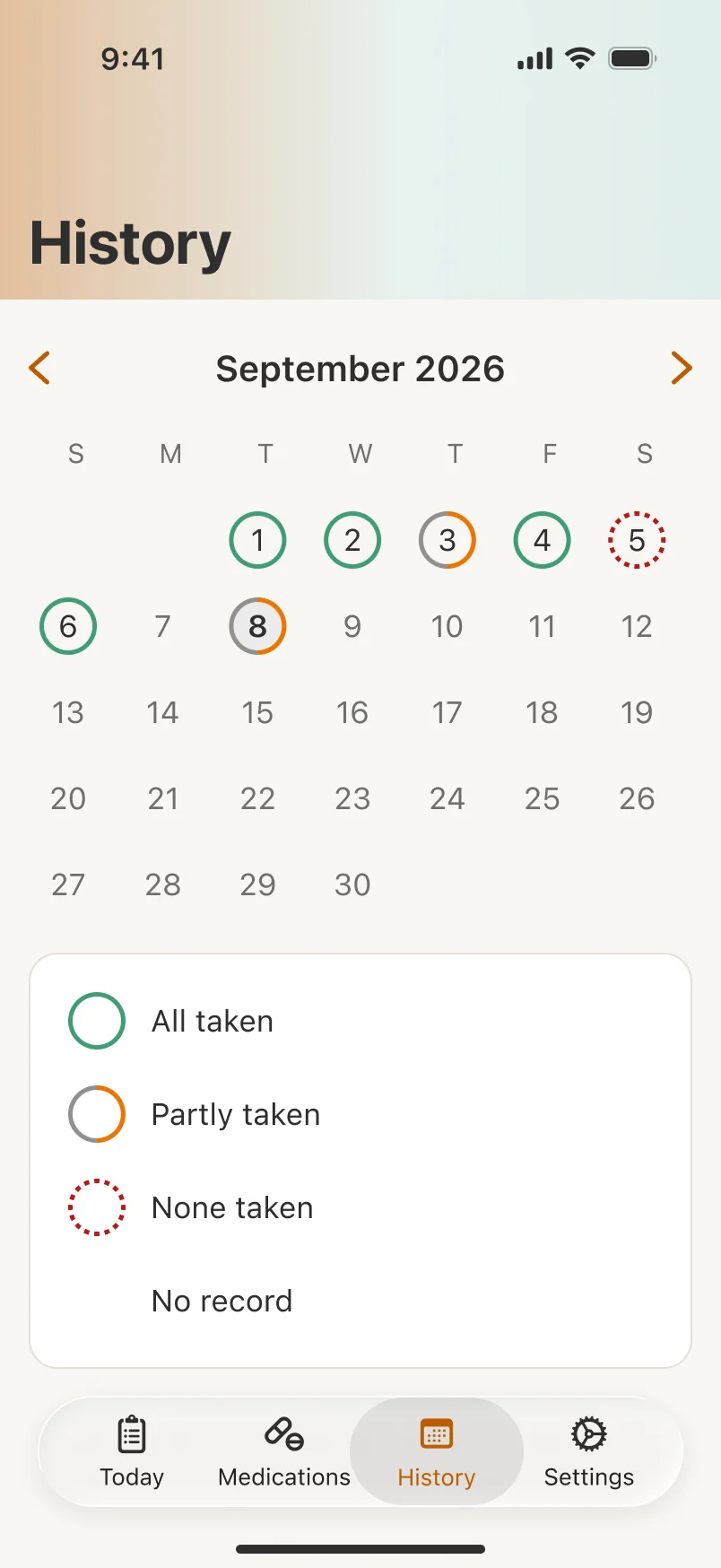
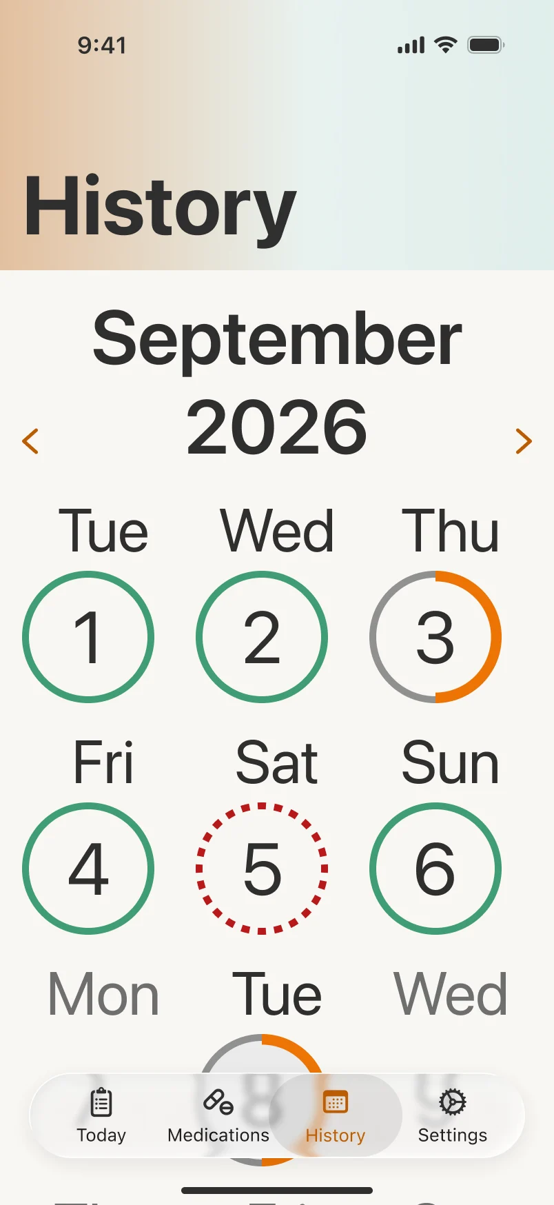
Dark mode
Every screen in Light, at the largest size and in Dark.
I chose a warm near-black instead of iOS’s neutral gray. In Dark, buttons switch to dark labels on bright color, because white text on them didn’t pass contrast.
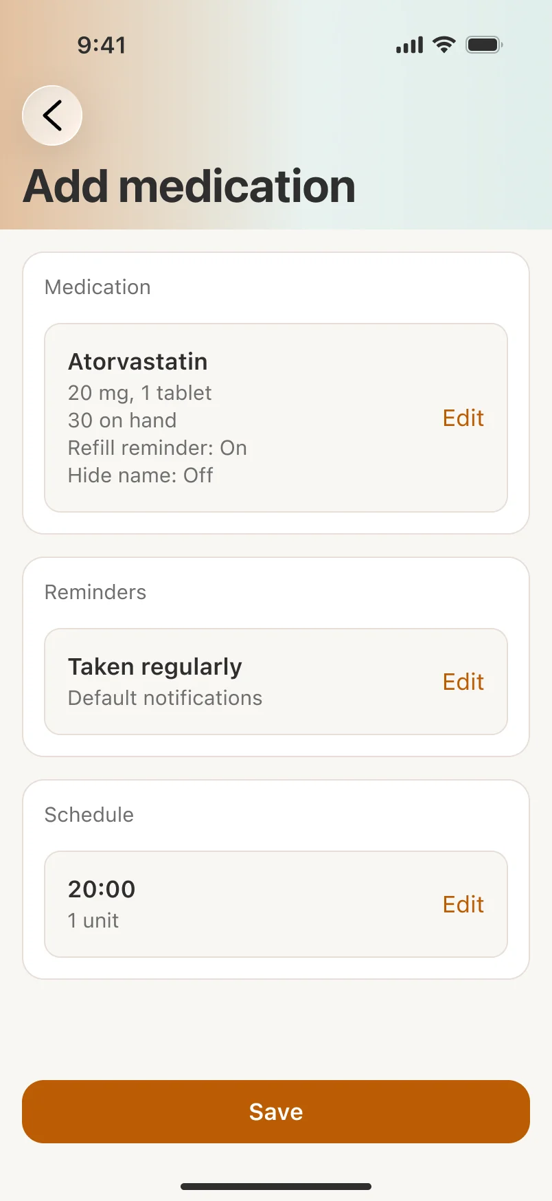
07Reminders
The reminder changed more than anything else, until it fit each medication.
- The question
- How persistent should a reminder be before it turns into noise?
- What I did
- Rewrote the rule three times: every ten minutes for an hour, then three for every dose, then one style per medication.
- Decision
- One-shot, Default or Critical, chosen per medication, and Mark taken right from the notification.
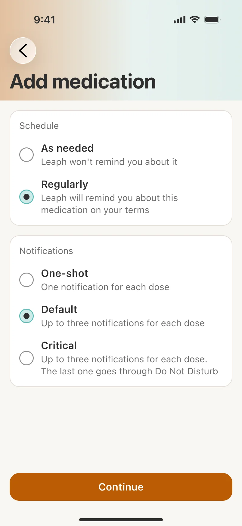
The whole idea rests on the reminder, so that’s where I changed my mind the most. After the audit, I wanted it to repeat every ten minutes for an hour. In the mockups, I cut that to three reminders for every dose. In the end, the answer was that each medication needs its own behavior, not one rule for everything.
One-shot
One reminder, for medications that don’t need more.
Default
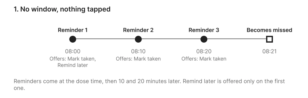
Up to three reminders, ten minutes apart. If none is answered, the dose counts as missed.
Critical
Up to three, and the last one comes through Do Not Disturb.
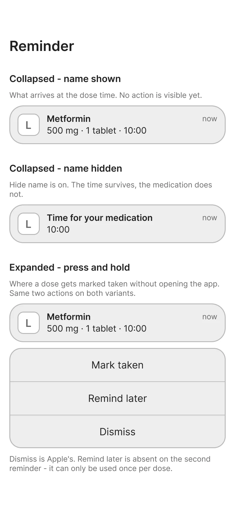
The notification
Two actions on the notification, and no Skip.
The notification offers Mark taken and Remind later. A mis-tapped Skip goes unnoticed; a mis-tapped Mark taken doesn’t. You can also hide a medication’s name, so it just says “Time for your medication.” Hiding the name never blocks marking the dose. One reviewer had to turn name hiding off before they could mark anything.
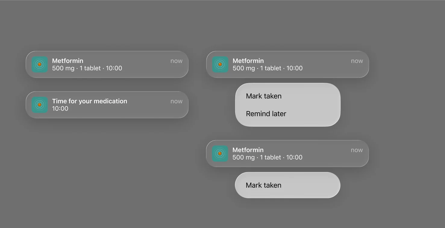
While writing this case study, I noticed the onboarding still promised three reminders for every dose, which is only true for Default. I changed it to “Up to three reminders for each dose.”
08Testing
I planned five people for three days. One took part, and still found what I’d missed.
- The question
- Does the built app hold up over several real days?
- What I did
- Planned five people for three days on their own iPhones. One took part, alongside 17 TestFlight installs.
- Decision
- Three fixes queued and four bugs logged with the developer.
The real app
Participants used the built app on their own iPhones, so real reminders were tested for the first time.
Three days of use
A first session, three days with the app, then a second part. Fifteen tasks, every one an action.
A stand-in schedule
Vitamin D, Magnesium and Ibuprofen for everyone. Nobody used real medicine.
A missed day, on purpose
Day 2 was left unmarked, so there was always a missed day to find and fix.
- participant, out of five friends and colleagues
- 1
- screen recordings over three days
- 11
- TestFlight installs, with no crashes
- 17
History, the right day, Backup & Export and the low-stock warning were all found without searching. The reminders arrived on time, with the medication name on the lock screen.
Where it went wrong
Three moments showed me where the design and the person disagreed.
- 01
The window
Asked for a window from 10:30 to 11:30, they first chose ±60 minutes, which made it two hours wide. They think in a range, not in plus-or-minus.
- 02
Skipped and missed
Asked to show they’d chosen not to take a dose, they marked it Taken. The difference was clear to me, not to them.
- 03
A default that saves the wrong time
Fixing yesterday’s dose, they kept the suggested time. The record said “Taken 11:02”: the time of the fix, on the wrong day.
What the recordings caught
Four bugs nobody noticed, the participant included.
Moving a dose added one
Moving the evening Magnesium from 20:00 to 21:00 added a second dose. The day read “0 of 4” and later showed both as missed.
“0 minutes late”
At the exact dose time, the row said late instead of due.
An unlabeled countdown
The Live Activity counted down in orange, with nothing saying what it counted down to.
The old name
The exported file still used the app’s old name.
None of this showed up in a demo. It only came up because someone used the app on real days. All four are now on the list I’m working through with the developer. I didn’t add analytics to find more: Leaph promises the only thing it sends you is a reminder.
09Version 2
Adding a medication, rebuilt as four short steps.
- The question
- How do per-medication reminders fit into adding a medication, without a long form?
- What I did
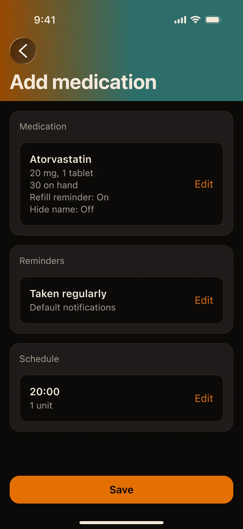
- My own design review and paper sketches, then four short steps and a summary that doubles as Edit.
- Decision
- Add became four steps, dose details moved to bottom sheets, and Dark sheets got a lighter level.
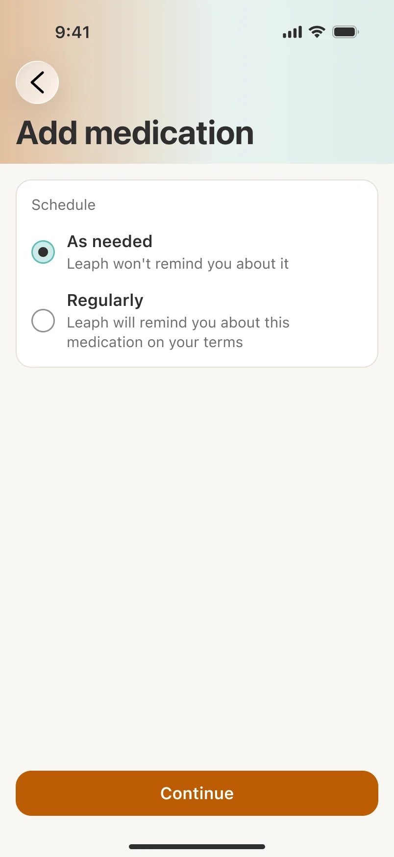
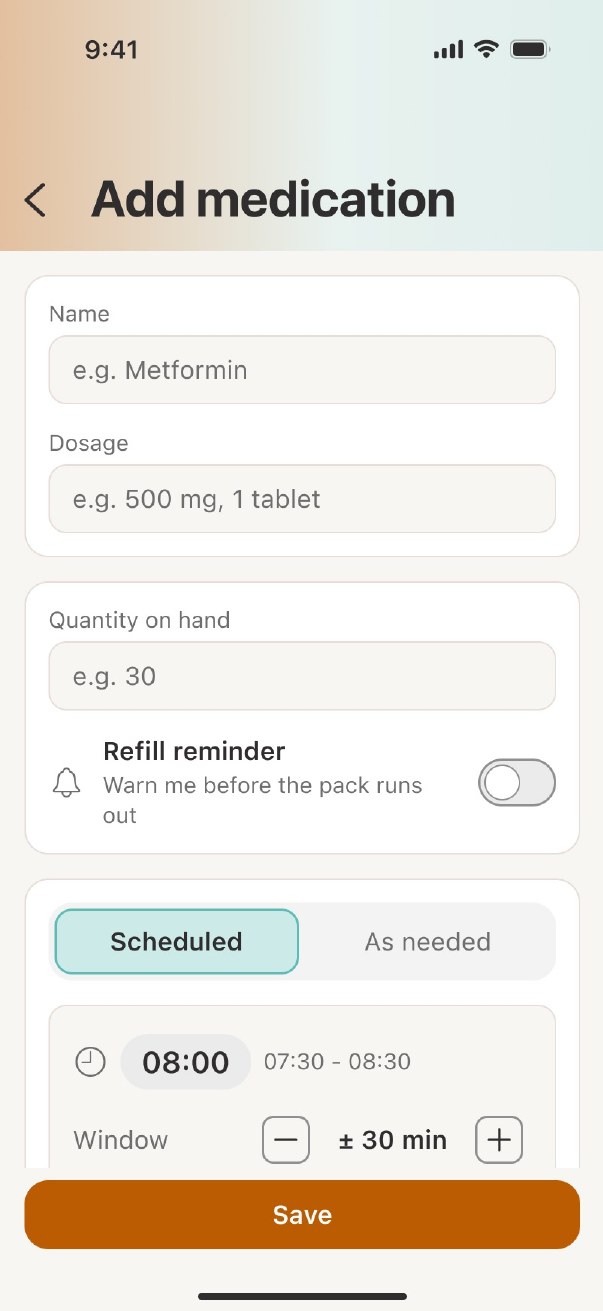
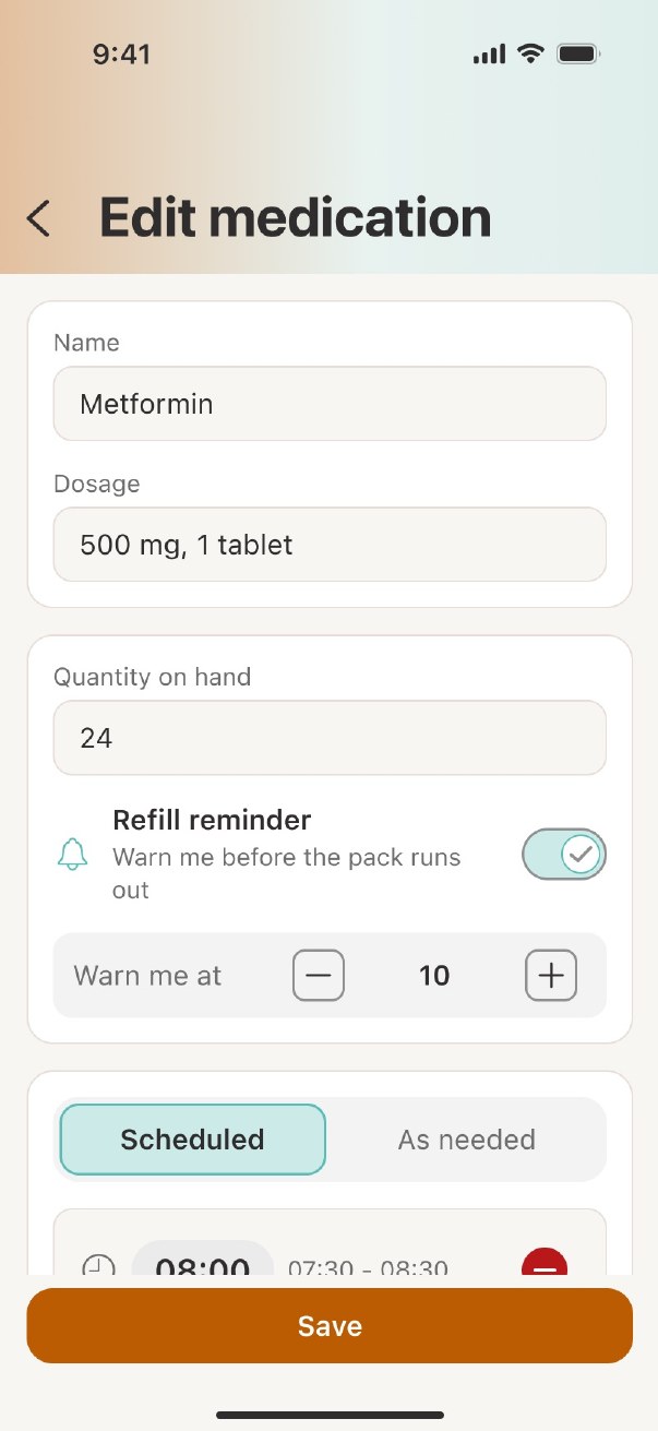
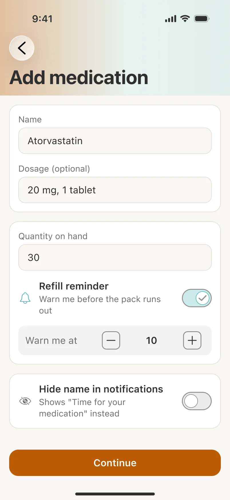
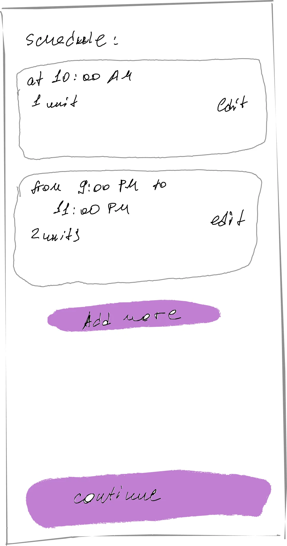
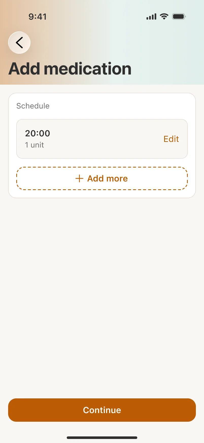
Version 2 came from my own design review, not the study. In version 1, adding and editing a medication were the same long form, and it never fit on one screen. Each medication also needed its own reminder settings, and that form had no room for them. So now each step answers one question and fits on one screen: what it is, how often, which doses, and a summary.
Version 1: one long form
Version 2: steps and a summary
Smaller fixes
One sentence per dose
Each dose time gets a plain sentence: “At 08:00 you’ll get the first notification. At 08:10 and 08:20, two more.”
Sheets, not overlays
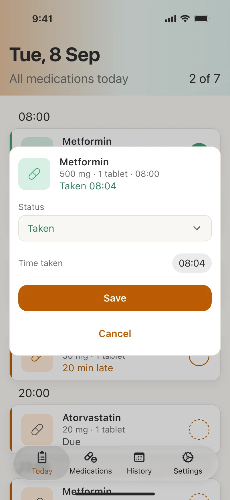
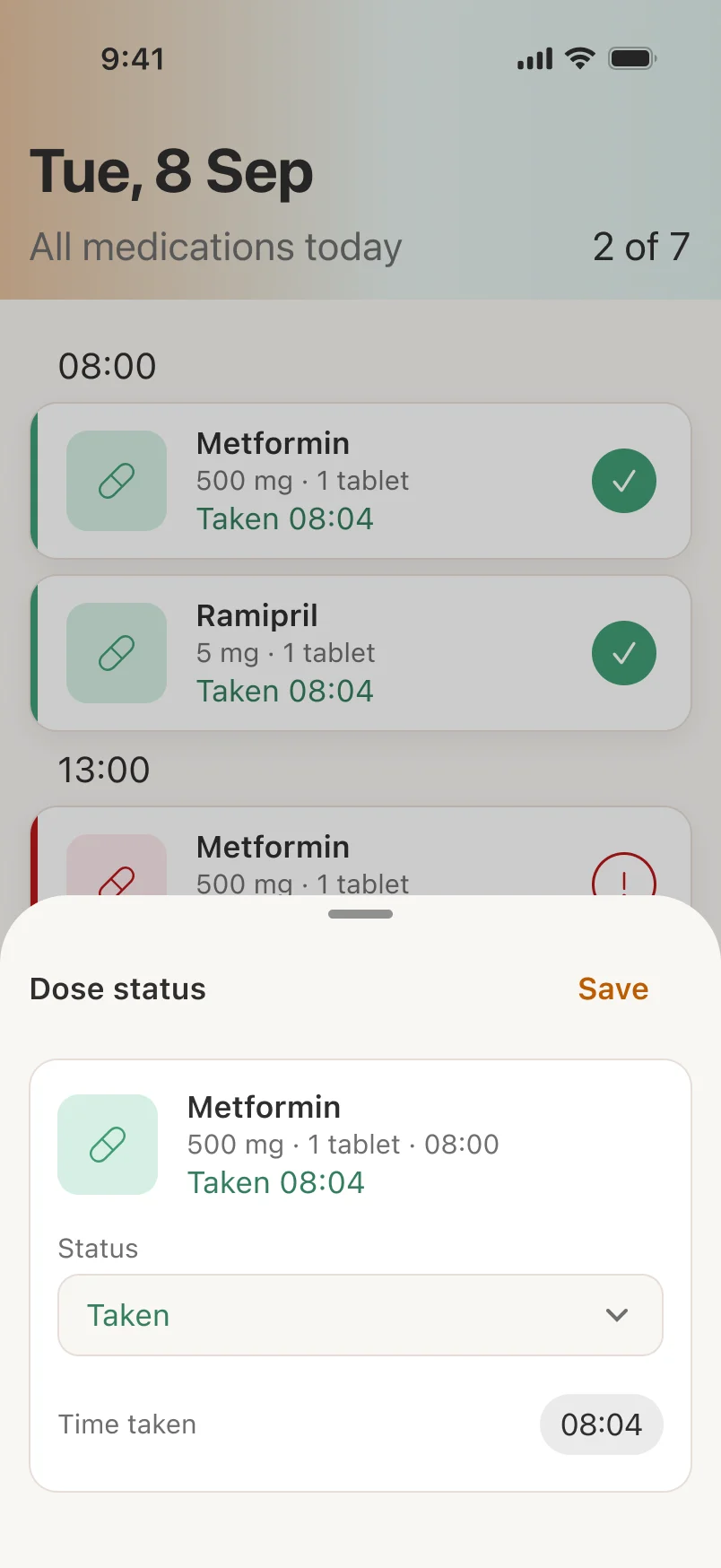
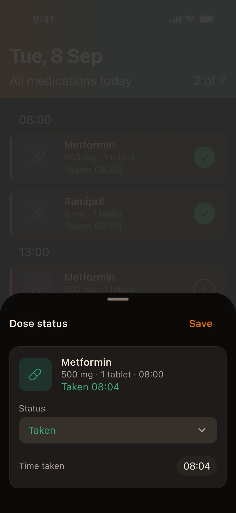
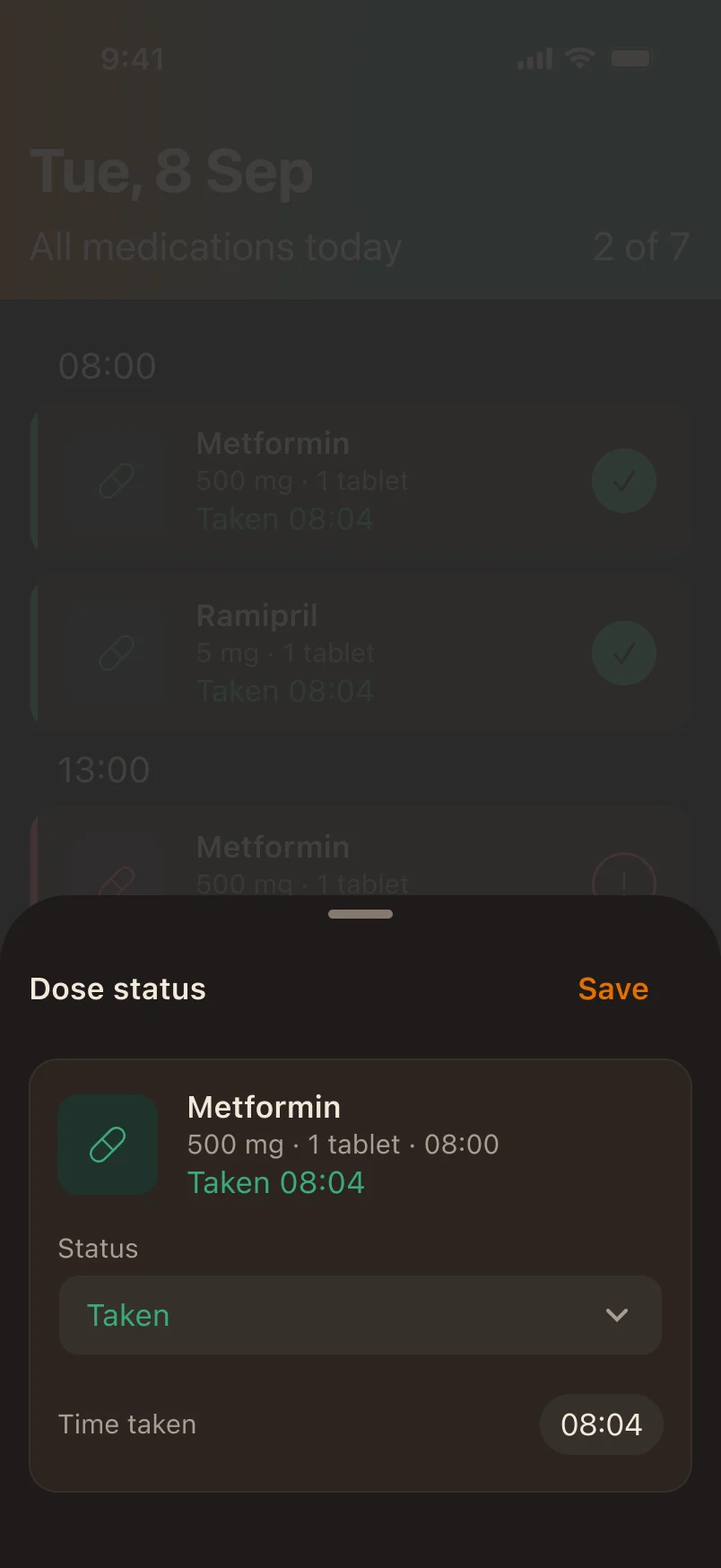
Dose details moved to bottom sheets. Save sits at the top, there’s no Cancel, and you swipe down to close.
One word less
I dropped “Scheduled” from each day in History, to match Today and keep the day readable at the largest size.
The Dark fix
In Dark, the sheet sank into the screen behind it.
I could have built a custom backdrop. Instead I added one more color level: everything inside a sheet gets one step lighter, the way iOS lifts its own sheets. Every text color in the sheets still passes 4.5:1. Then I cleaned up the design system: one menu component for all six menus, one sheet header for all 24 sheets.
10iPhone Duo
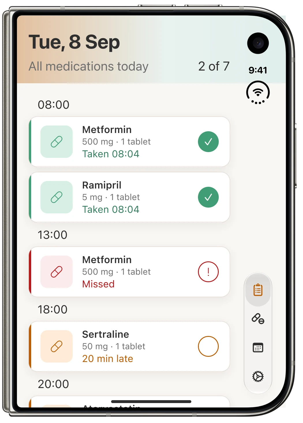
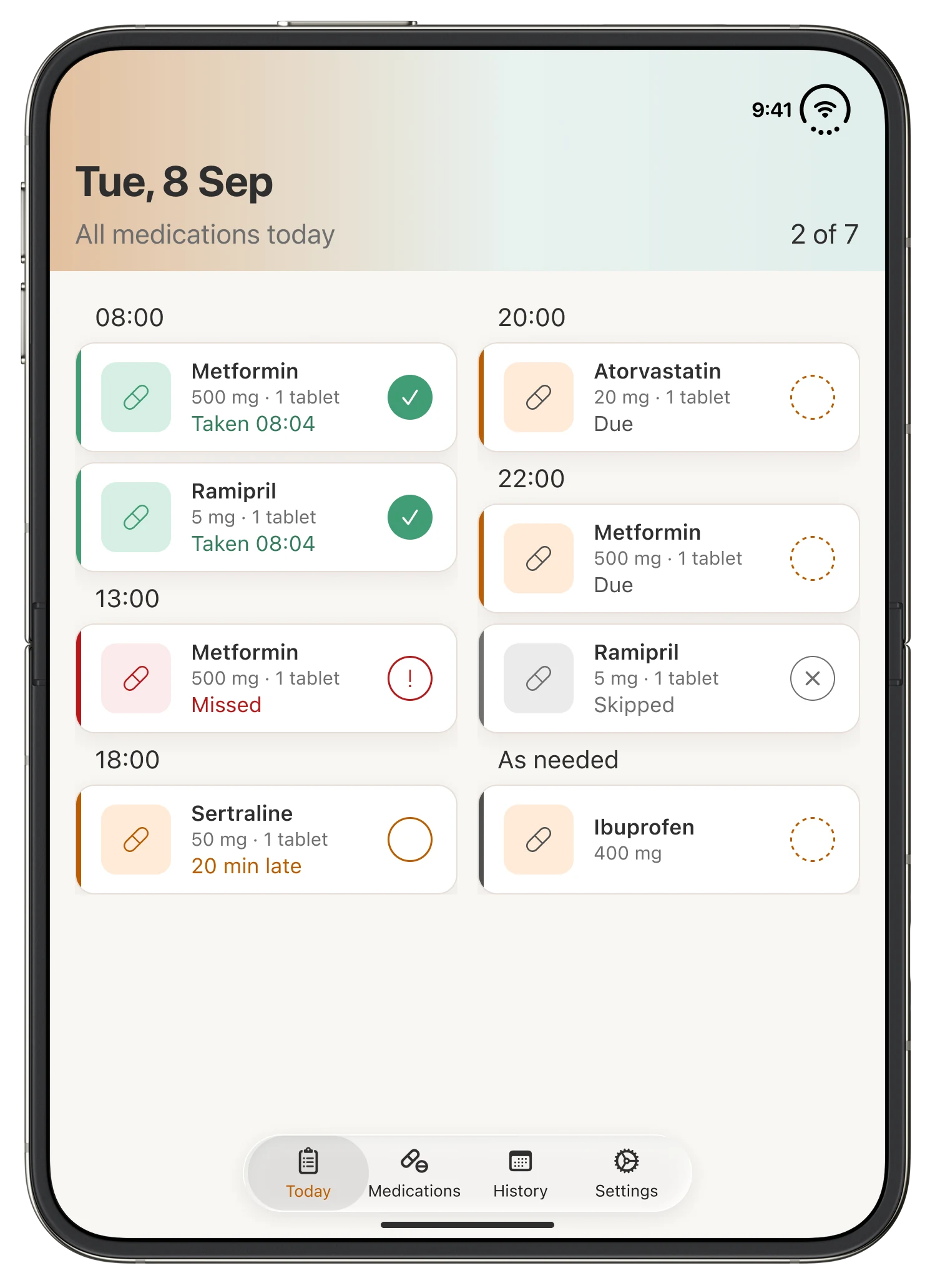
On iPhone Duo, the extra space shows more of the day, not bigger cards.
- The question
- What should the extra space on a foldable show?
- What I did
- Adapted four screens to five positions, following Apple’s guidance and iOS templates.
- Decision
- More of the day, not bigger cards: two columns open, two panes sideways, nothing on the fold.
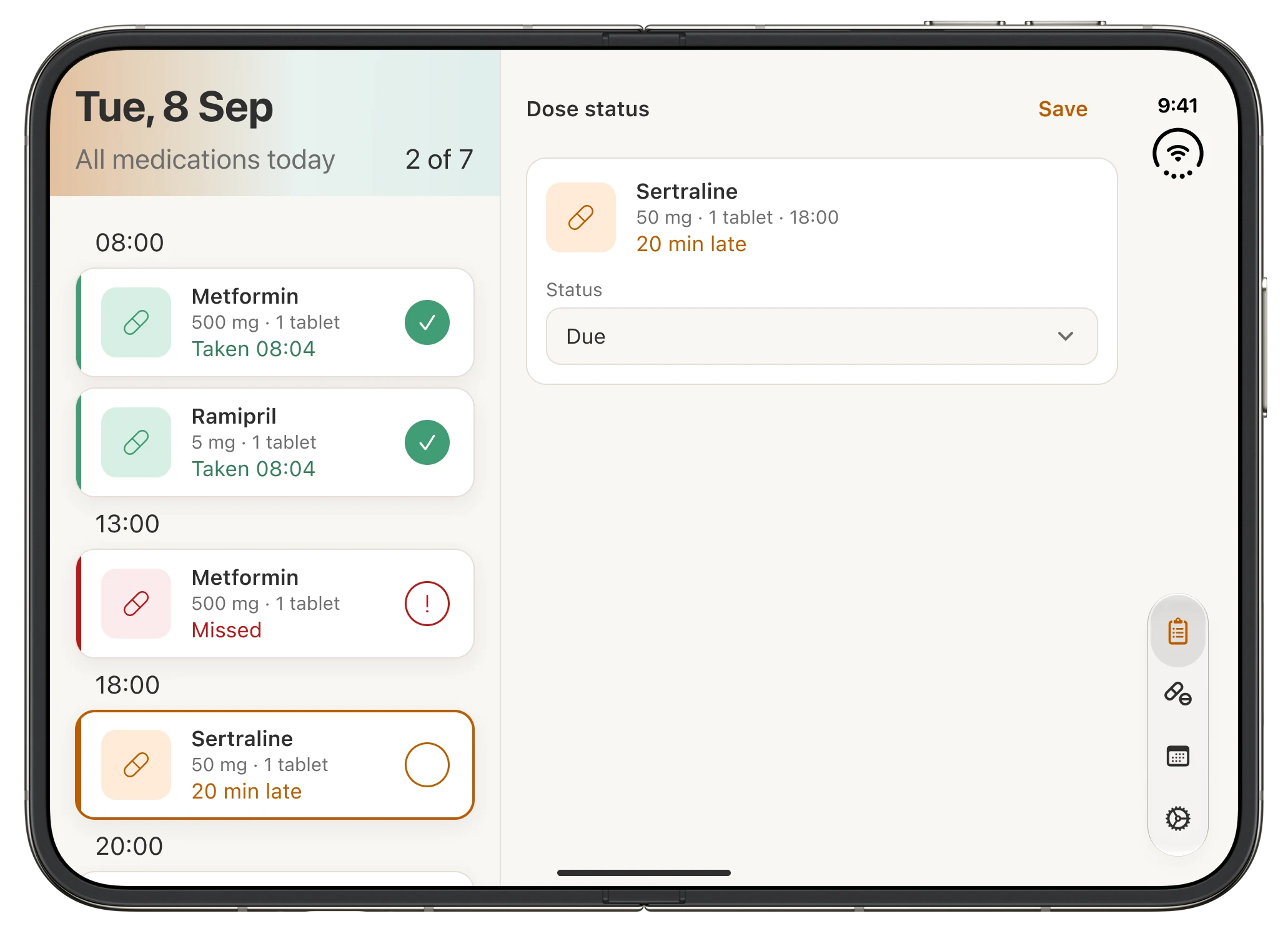
I adapted four screens for iPhone Duo, following Apple’s guidance and its iOS templates: Today, Edit medication, History and Add medication. Each works in five positions: the outer display in portrait and landscape, and the inner display in portrait, landscape and folded. That’s 20 screens.
On the outer display, the bars move to the side and the layout stays one column. Open the phone, and Today splits into two columns, so the whole day still reads in one look. Turn it sideways and it becomes two panes: the day on one side, the dose you tapped on the other. When it’s folded, nothing sits on the fold.
11Working with a developer
Not only “Is this right?” but “What does it cost to build?”
- The question
- What does a design rule cost once it has to be built?
- What I did
- Worked with a developer from development on, checking each custom element against what iOS gives for free.
- Decision
- Back to Apple’s own back button and tab bar, and the system backdrop behind sheets.
I worked alone until the prototype. When development started, a developer joined me, and the question changed.
The back chevron
I’d made it orange, because it’s an action. But on iOS, a back button that isn’t Apple’s own loses behavior the system gives for free. I went back to Apple’s button, in its default color.
What the system gives for free
I built a tab bar animation, then removed it: the system tab bar already moves. I kept the system’s dimmed backdrop behind sheets, because a custom one means rebuilding the fade, the drag, tap-to-close and VoiceOver support.
Some things are possible, some aren’t, and some are possible only at a price. I learned to rethink quickly, and to make those calls together with the person building the product.
The outcome
What changed, what didn’t, and what I’d do differently.
Did it work?
The parts I could test held up. One participant is a signal, not proof.
| Goal | What happened | How I know |
|---|---|---|
| Keeps asking | Reminders arrived on time on a real iPhone, with the medication name on the lock screen. | Test recordings over three days |
| A record that stays yours | History, the right day, Backup & Export and the low-stock warning were all found without searching. | Test recordings |
| Ready for real use | 17 TestFlight installs and no crashes. Leaph is now live on the App Store. | TestFlight and App Store |
| One look at large text | Every screen was designed at the largest text size, where layouts change instead of growing. | Design review; still to test with people who use it |
Reflection
What was hard, and how I got through it.
- 01
Research without interviews
I had reviews, not people. I gave every note a type, wrote down what I didn’t know, and skipped personas instead of inventing them.
- 02
A whole day at the largest text size
Big type and big targets leave room for very few doses. Making everything smaller wasn’t an option.
- 03
A reminder rule that kept changing
I rewrote it three times, looking for one rule that worked for every dose.
- 04
A study with one person
Only one of five people took part, with no voice comments, so there was no “why.”
- 05
Learning what a design costs
Some of my rules were expensive once they had to be built.
- 06
Saying no
Caregivers, streaks and anything medical all had a case. Cutting them was harder than adding them.
What I’d do differently
- 01Test with people who have the problemMy friends were kind, but none of them needed a medication reminder. Next time: fewer tasks, a moderator in the room, and the right people.
- 02Question every defaultA suggested time looked helpful and saved the wrong one. A default is a decision, too.
- 03Name things the way people thinkSkipped and the ± window made sense to me. Words and controls have to match how people already think.
Next steps
Real use
Leaph is now on the App Store. Real use will show what one participant couldn’t.
Fix what the study found
Move a dose instead of adding one, label the Live Activity, set the window as “from – to”, explain Skipped, and fix the default time.
Settle two differences
The build lets you undo by tapping the circle again, and log as-needed doses from History. My design didn’t. We still need to decide.
Test the screen reader notes
I wrote VoiceOver notes for six screens. They still need testing on a device.
The reminder is how Leaph works. The record that stays yours is why it exists.
— Iakov Grechukhin, UX & accessibility designer

 (opens in a new tab)