Case study 03 · Personal project · Sep – Oct 2026
A driving schoolthat tells youwhere you stand.
Clearway is a concept for a New York driving school for first-time drivers. Students book lessons themselves, see exactly what’s done, and hear from their instructor, not from a progress bar, when they’re ready for the road test.
Clearway
Overview
Results
- platforms from one design system
- 4
- screens, each in light and dark
- 131
- decisions logged, each with what I rejected
- 15
- roles in one app: student and instructor
- 2
The premise
I started with a real driving school’s website and one question.
What would this look like if it were built for the person learning, and not for the person selling lessons?
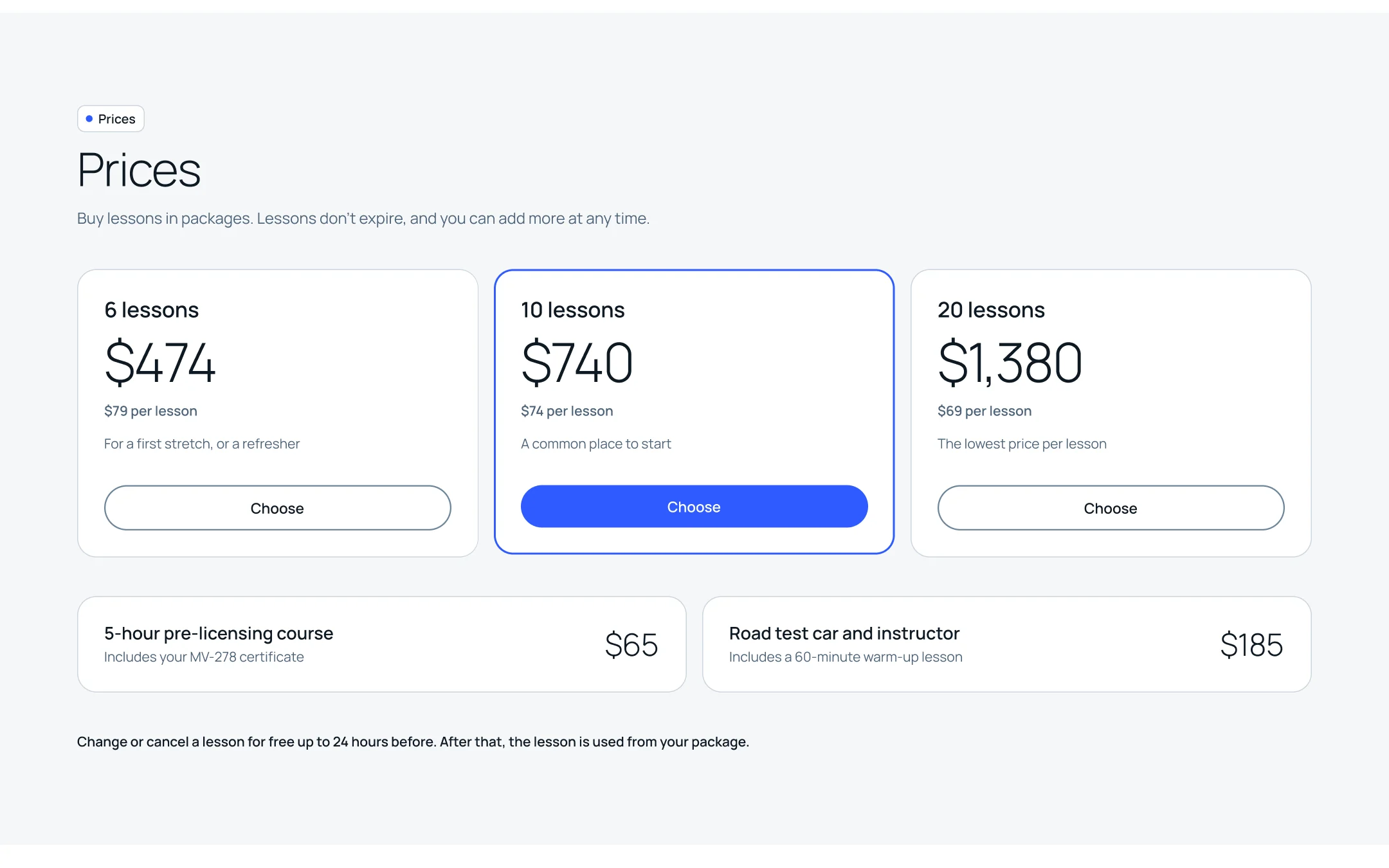
Most driving school websites sell a package and stop there. You book by phone, in office hours. Nobody tells you how close you are to the test, so you keep buying lessons until someone says you can stop.
Repainting that site wouldn’t change any of it. So I invented a school with a different promise, called it Clearway, and set it in New York, where plenty of people learn to drive later because they never needed a car before.
What this is
A concept, on purpose.
There was no client. I haven’t tested Clearway with learners yet, so nothing on this page is presented as proven. What I can show is every decision I made, what I turned down, and where I got it wrong.
Left out on purpose: checkout, sign-up and the school’s admin side.
01Three questions
The idea
A learner opens the product with three questions. I built everything on them.
To keep myself honest I wrote one learner and kept her on every screen. Ana is 33. She moved to Queens from Belgrade, where she never needed a car. She works full-time, so she books at night. She has her permit, she’s done the 5-hour course, and she’s six lessons into a package of ten.
Ana isn’t a research persona. She’s a scenario with real dates and a real next lesson, and every screen had to stay true to it. If a number on the booking page disagreed with the dashboard, the design was wrong.
Question 1
Where am I?
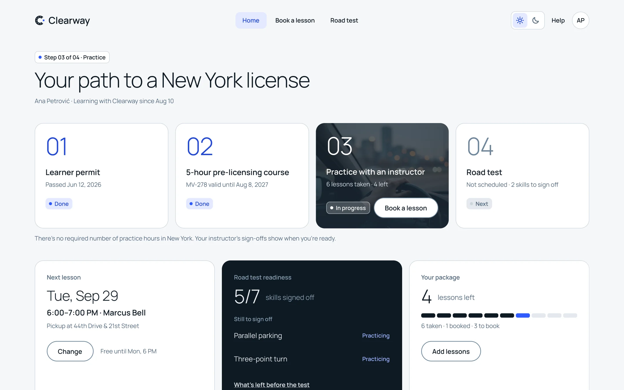
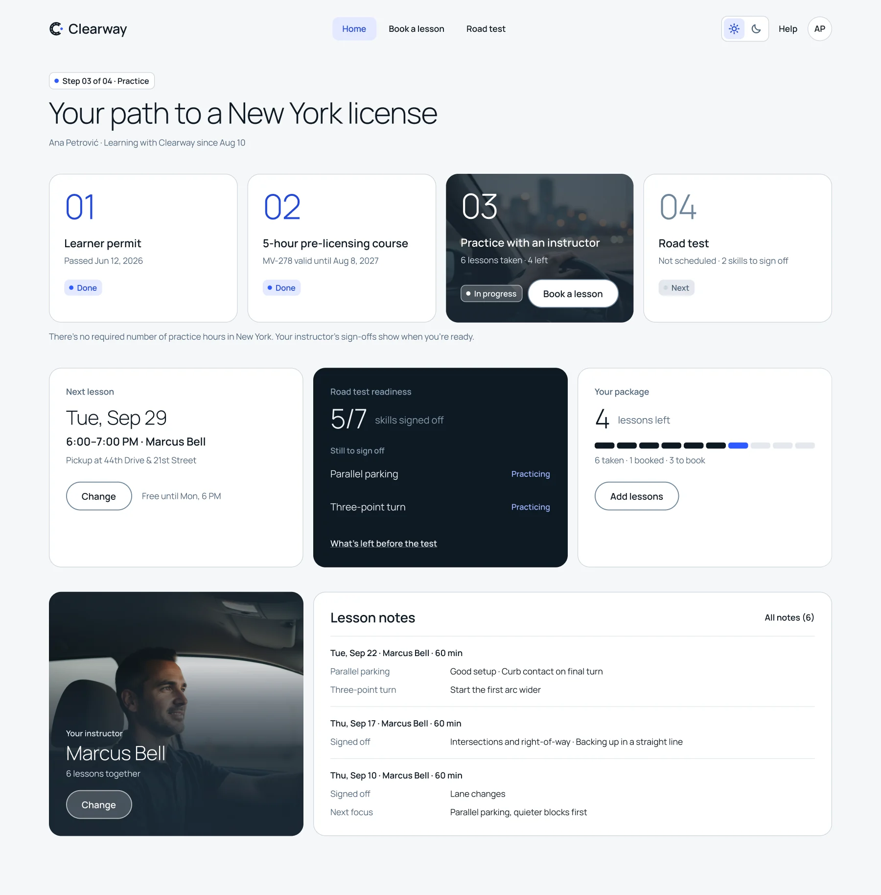
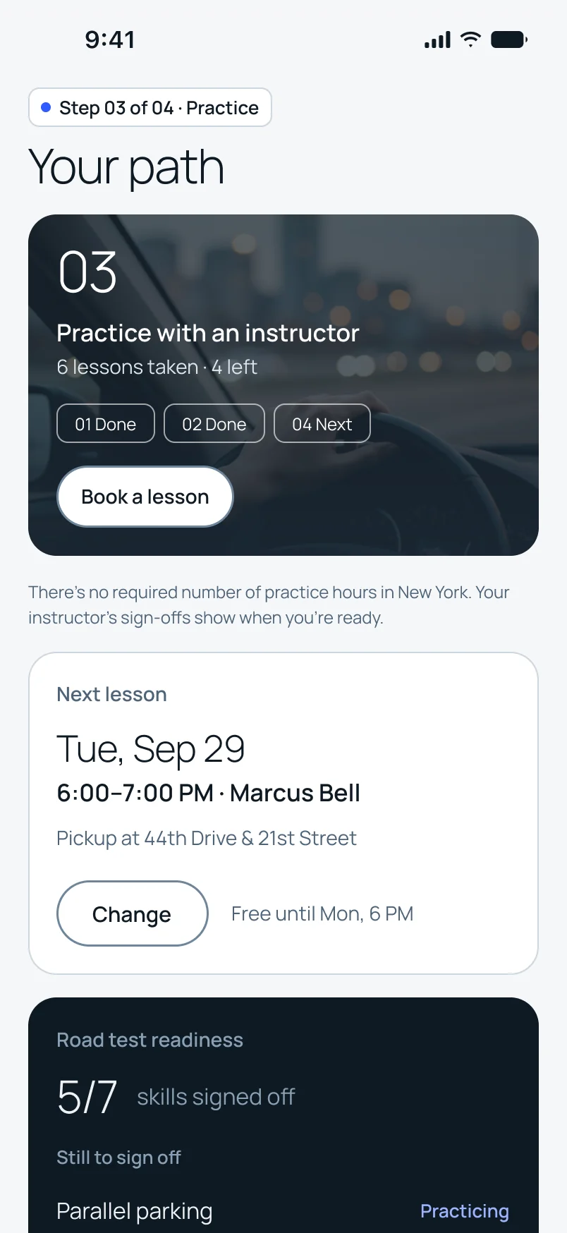
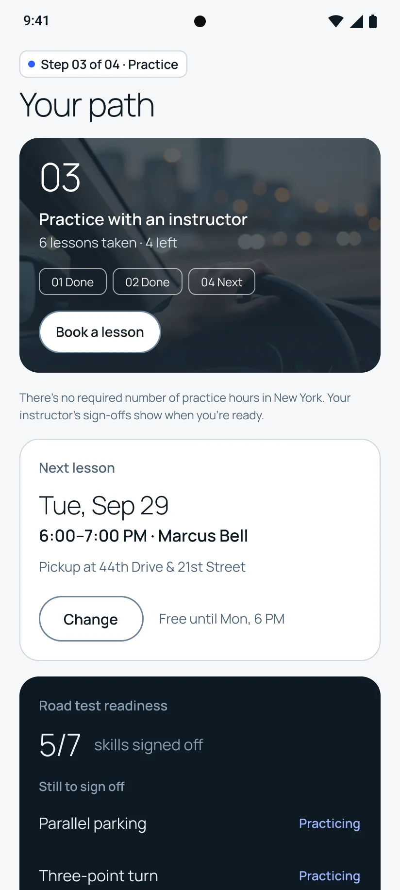
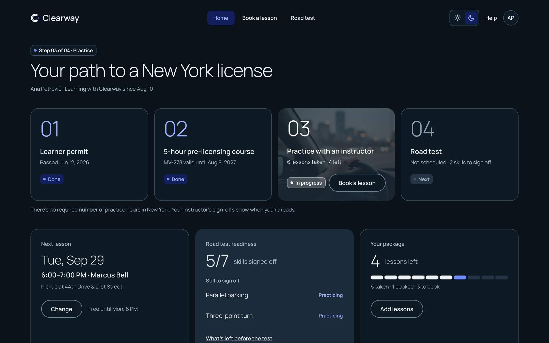
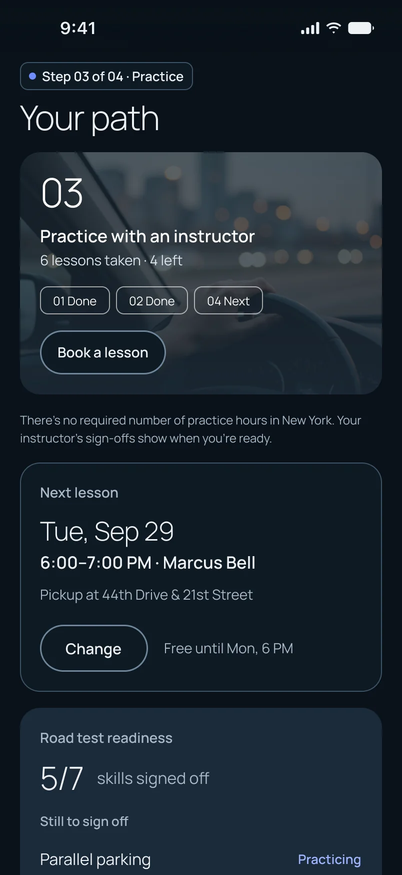
Getting a license in New York is four steps, and most learners can’t name them. The dashboard opens with the path: learner permit, 5-hour course, practice, road test. Finished steps say when they were finished. The current step says how far in you are.
I rejected an activity feed, because it buries the next lesson under history, and a big progress graphic, because it spends the best part of the page on decoration.
Question 2
When is my next lesson?
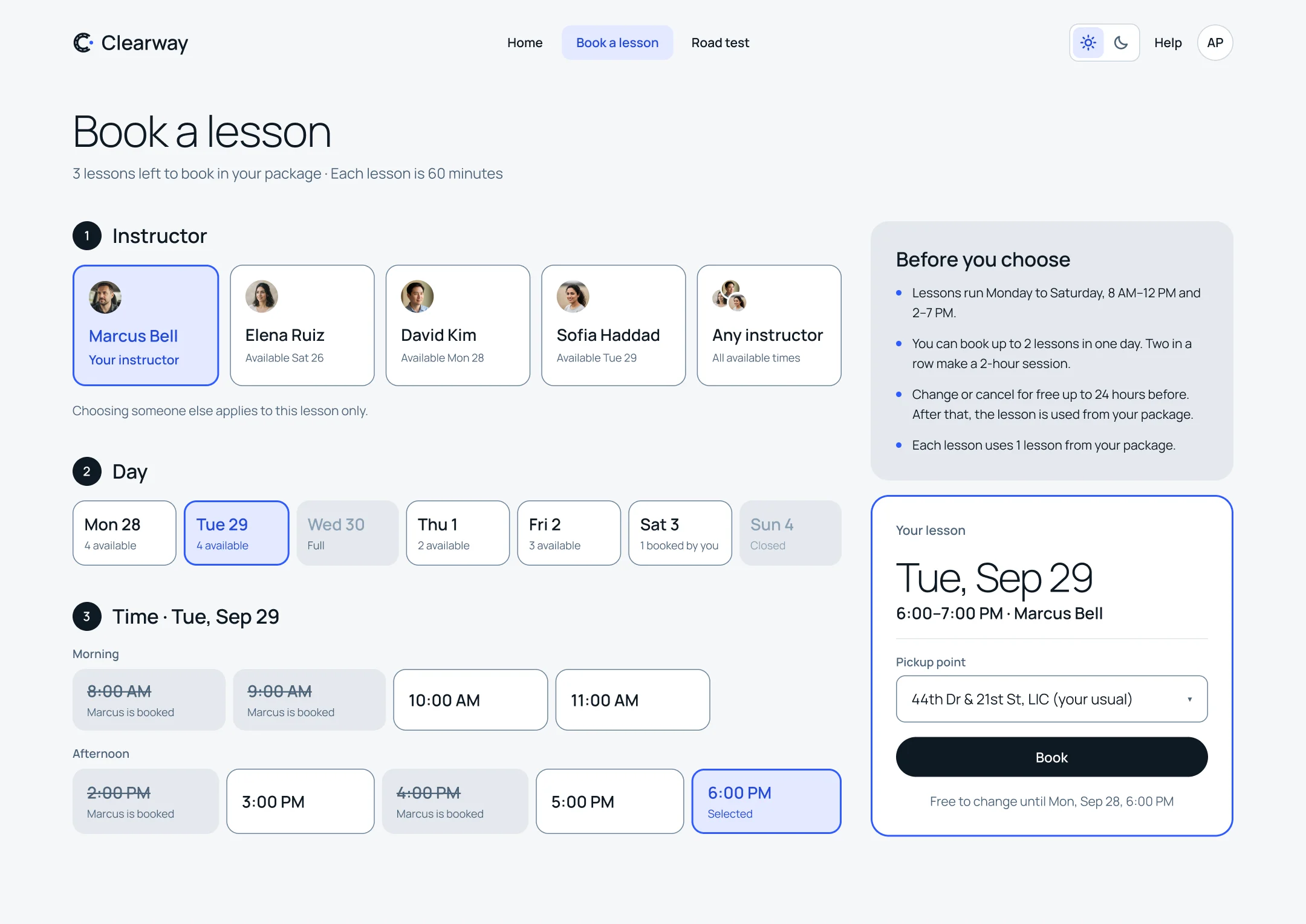
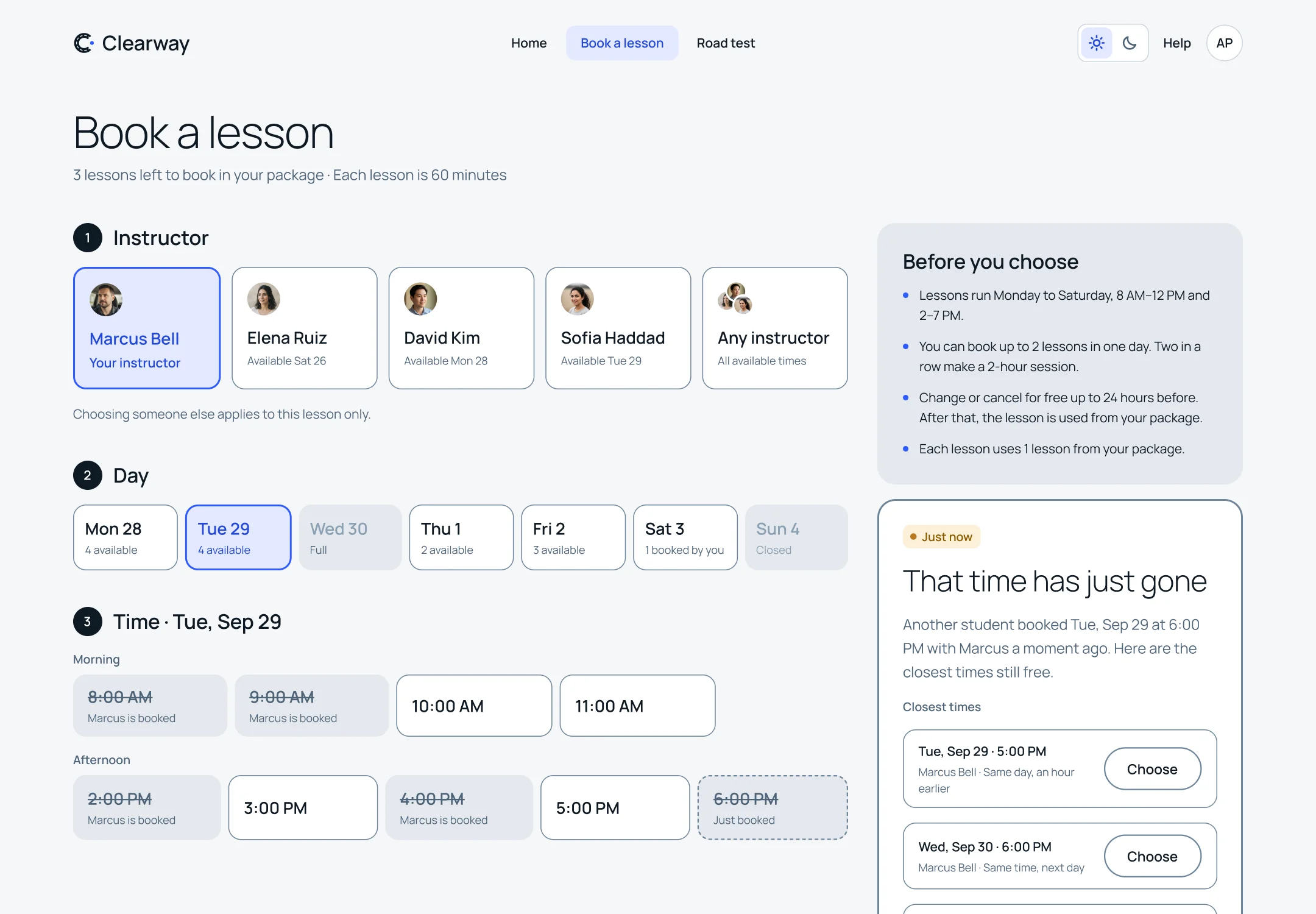
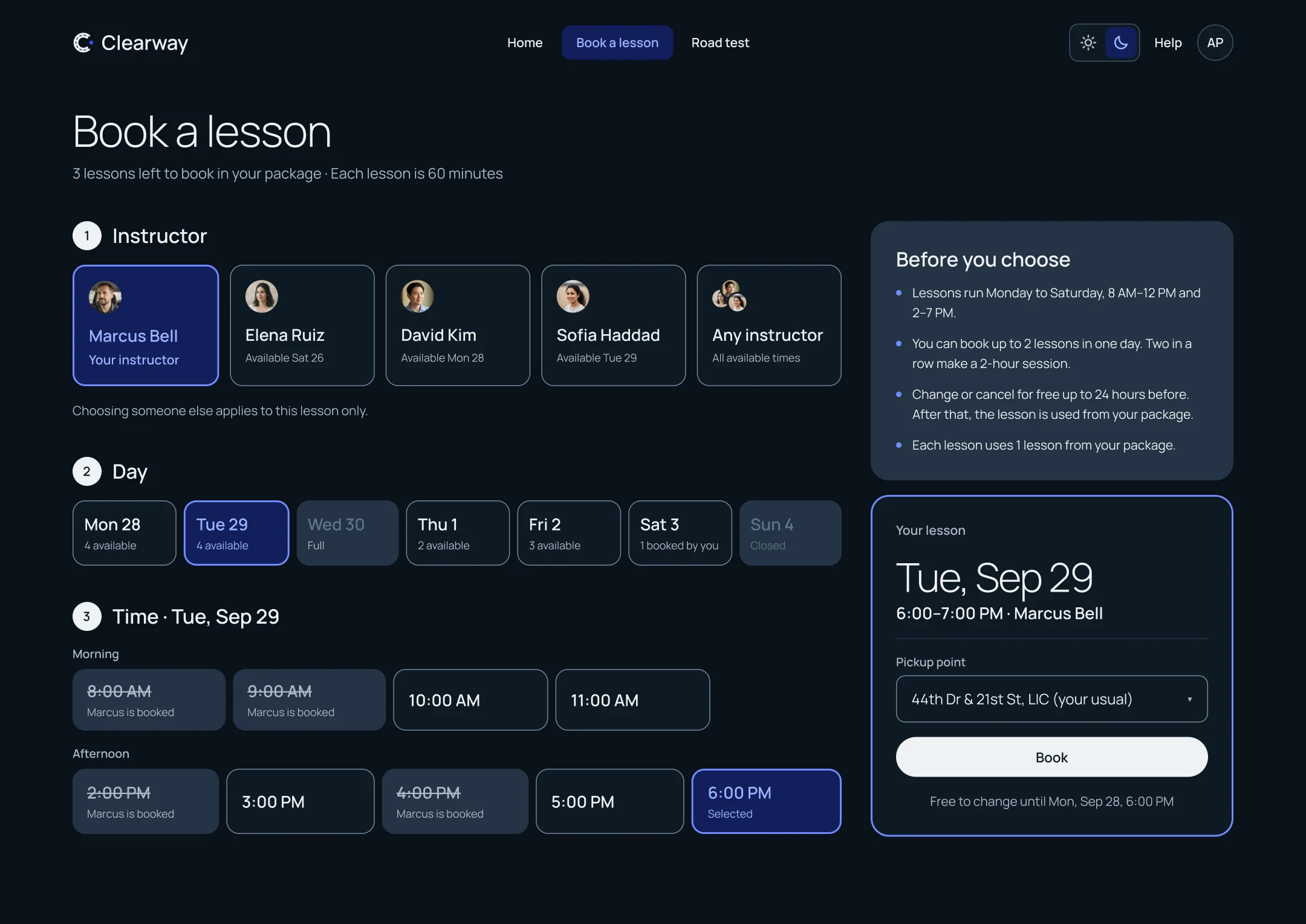
The next lesson sits beside the path, with the pickup point and the last moment it can be changed for free. Booking another one runs in a single order: instructor, then day, then time. The current instructor is already chosen, and “Any instructor” is one click away.
The rule I held to was rules before you click, not errors after. A time the student can’t book is shown as unavailable, with the reason written on it. Booking shows one week at a time, because more than that turned a decision into a search.
Question 3
Am I ready?
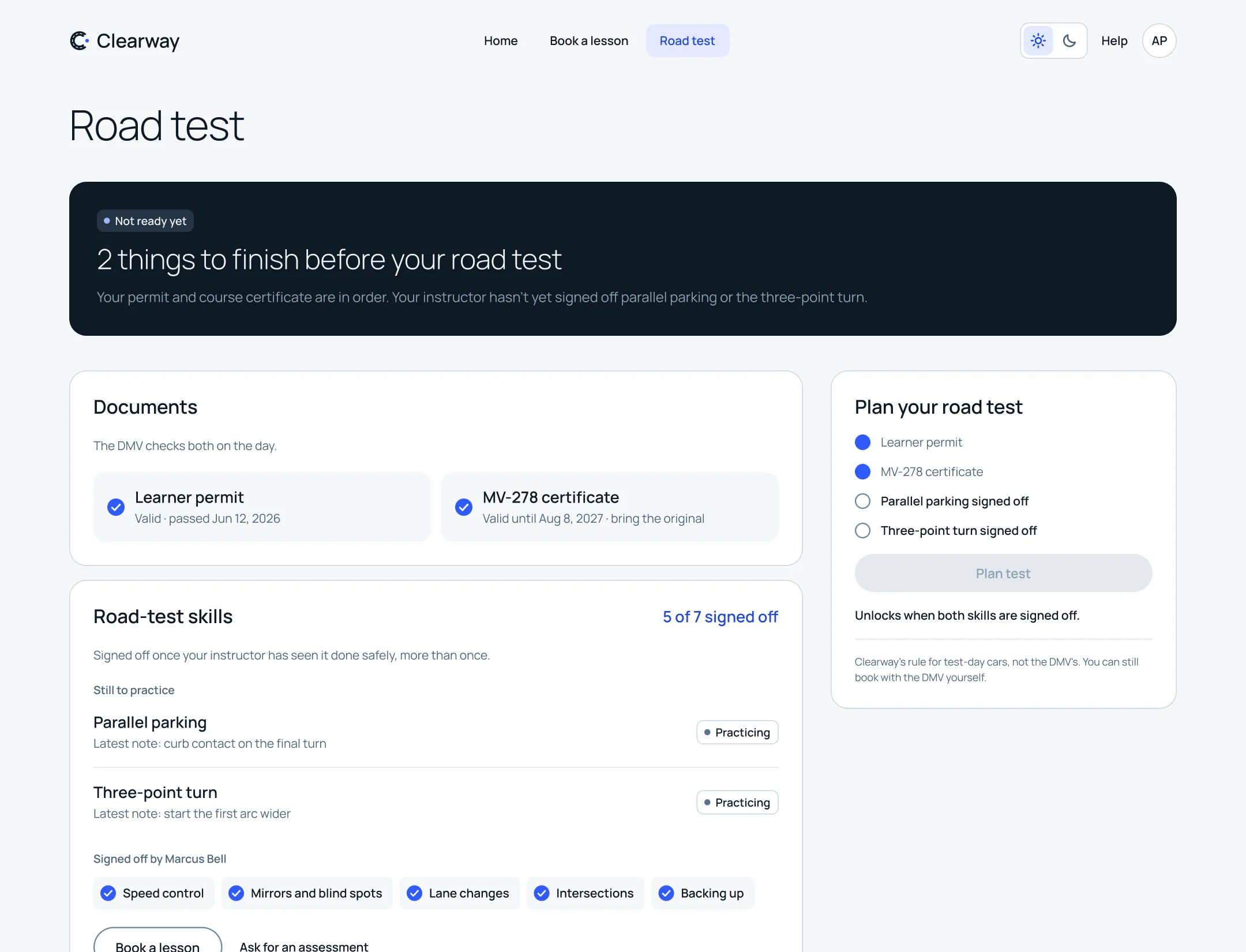
This was the hardest one. New York doesn’t require a set number of practice hours from applicants 18 and over, so an hours bar would measure the one thing that doesn’t matter. A percentage would claim a precision nobody has.
Readiness in Clearway is a list of seven named road-test skills. Each one is Not started, Practicing or Signed off, and each sign-off shows who gave it and when. The summary is a count: 5 of 7 road-test skills signed off. It’s never a ring or a gauge.
One skill didn’t fit. Highway merging matters for real driving, but the New York test is driven on local streets. Counting it would block readiness on something the test doesn’t check, so it sits in its own group, called beyond the test.
The page is also honest about whose rule is whose. The permit and the course certificate are the DMV’s requirements. The skill sign-offs are Clearway’s own rule for lending its car on test day, and the page says so.
02What Clearway won’t do
The stance
Most of the design is things Clearway refuses to do.
I kept a log of fifteen decisions, and next to each one I wrote down what I’d turned down. Reading it back, the rejections were the product. A school that makes money from lessons has every reason to pressure a learner. Clearway is what happens when it doesn’t.
| Clearway won’t | What it does instead | Why |
|---|---|---|
| Counts named skills, with who signed each one off | A percentage implies a precision nobody has | |
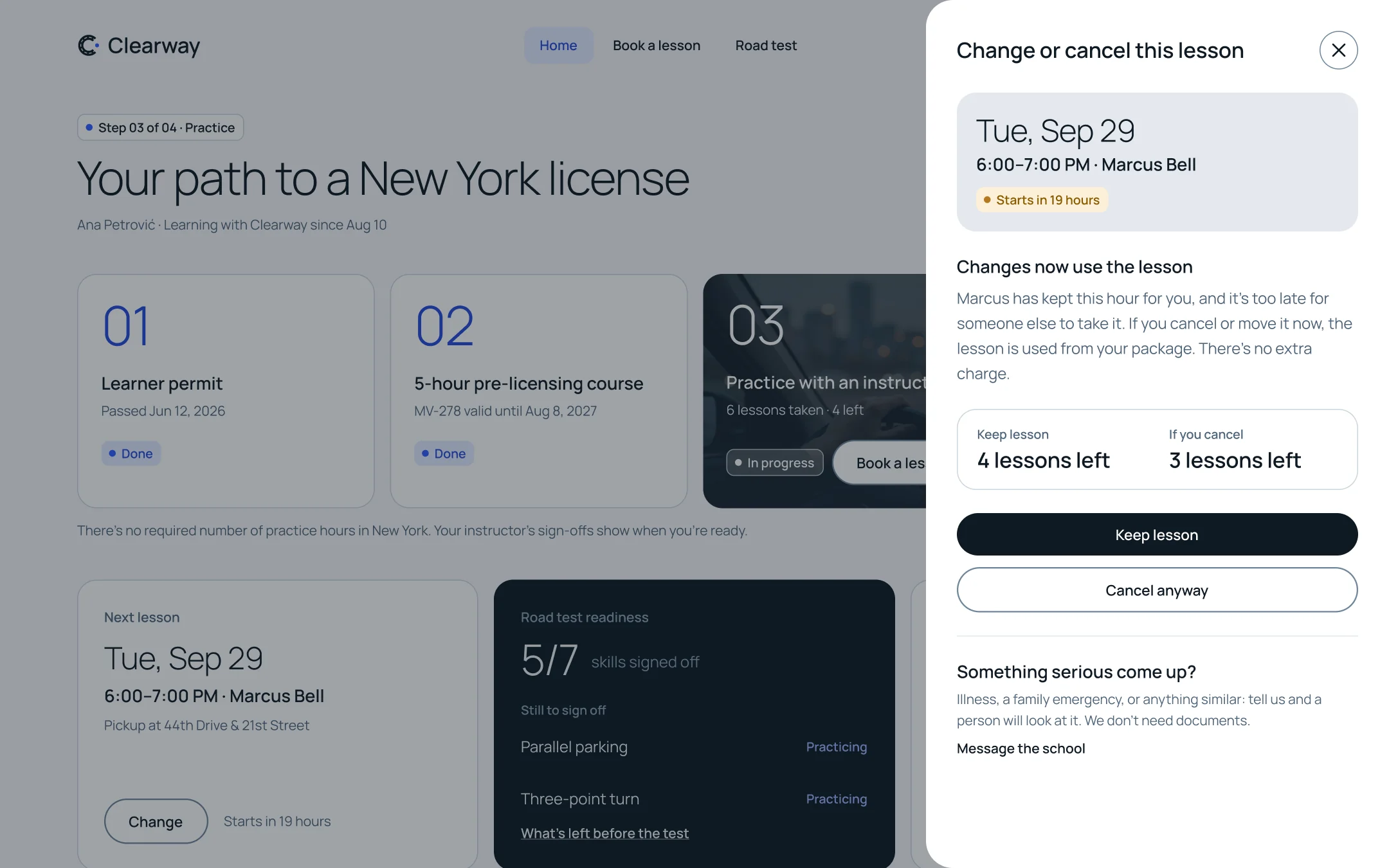
| Updates the slot in place, offers the three closest free times and keeps your instructor and day | A timer adds pressure and wastes the choices you already made | |
| Uses the lesson from your package; no card is charged | The package already holds the money, so a fee is only a punishment | |
| Inside 24 hours, Keep lesson is the main action, with a way to message the school if something serious happened | The cheapest choice should be the easiest one | |
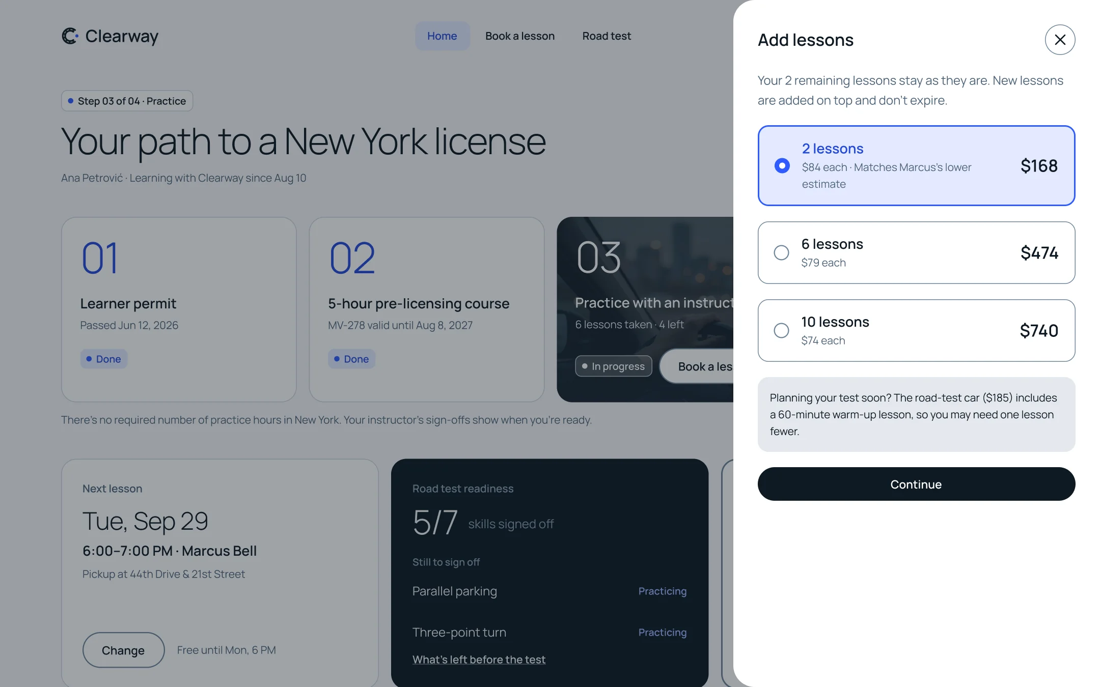
| Shows a low package inside the package module, with the instructor’s estimate and the smallest top-up first | A pop-up at login is a paywall in disguise | |
| No reason field, and your sign-offs stay with you | Any field implies an explanation is owed | |
| Moves the lesson; the old time is held until the new one is confirmed | You should never end up with no lesson | |
| Shows the product itself on the landing page | For an invented school, both would be made up |
03The other seat
The instructor
Readiness is only believable if you can see where it comes from.
If the student’s readiness comes from the instructor, the instructor’s side had to exist. Leaving it out would have made the whole readiness page a nice-looking claim.
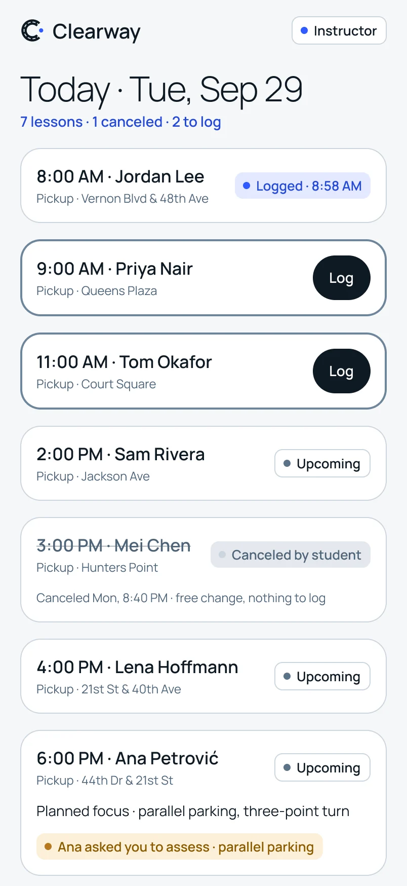
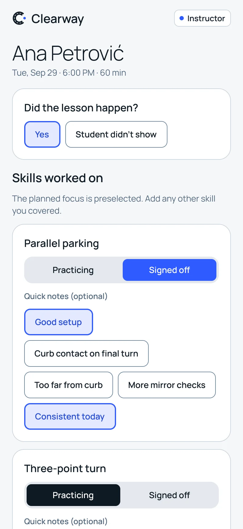
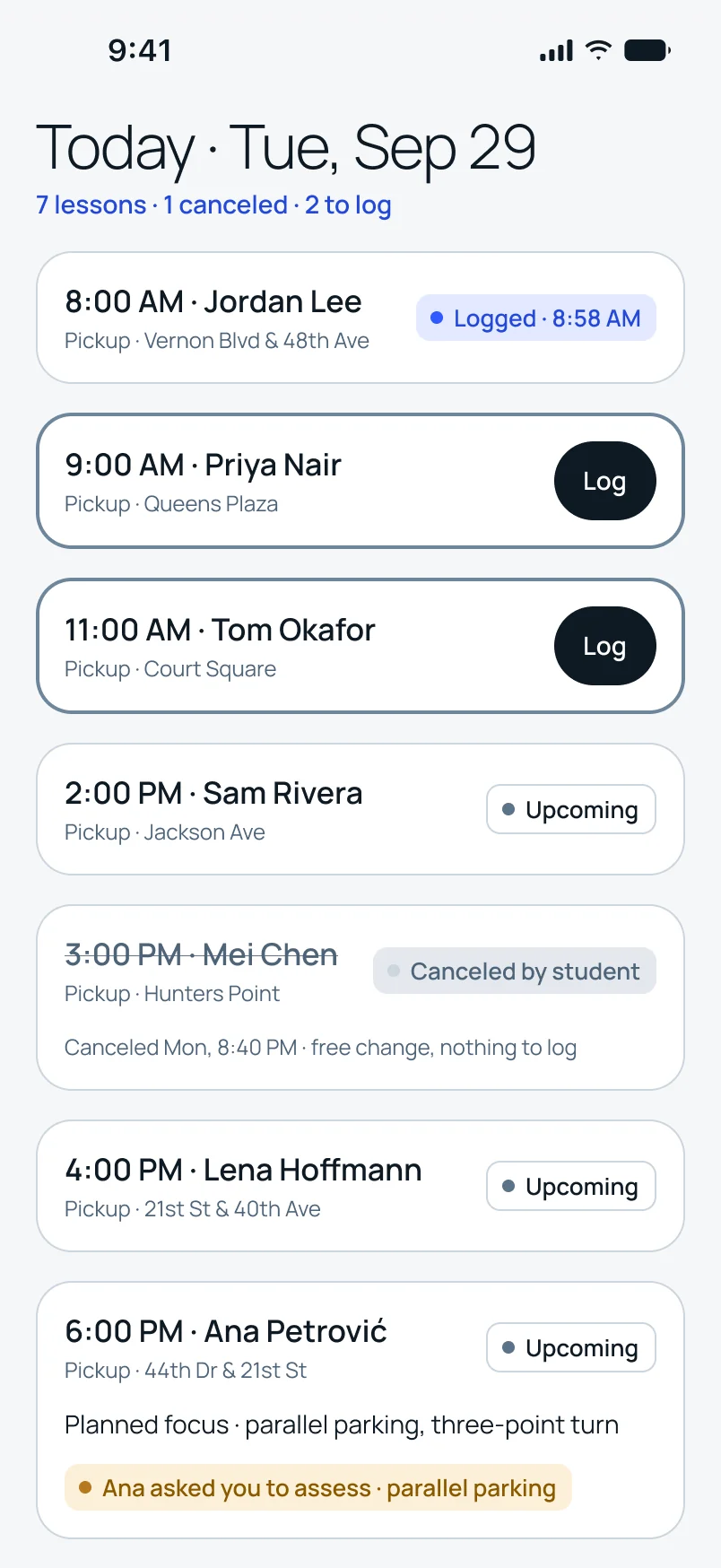
I designed it as one lesson log on a phone, because that’s what an instructor has in the car. After a lesson they tap each skill to Practicing or Signed off, add a set phrase if it helps, and save. It takes about thirty seconds, which matters when you teach seven lessons a day.
The set phrases are written in the product’s voice, because the student sees them exactly as the instructor chose them: “Curb contact on final turn,” not a grade.
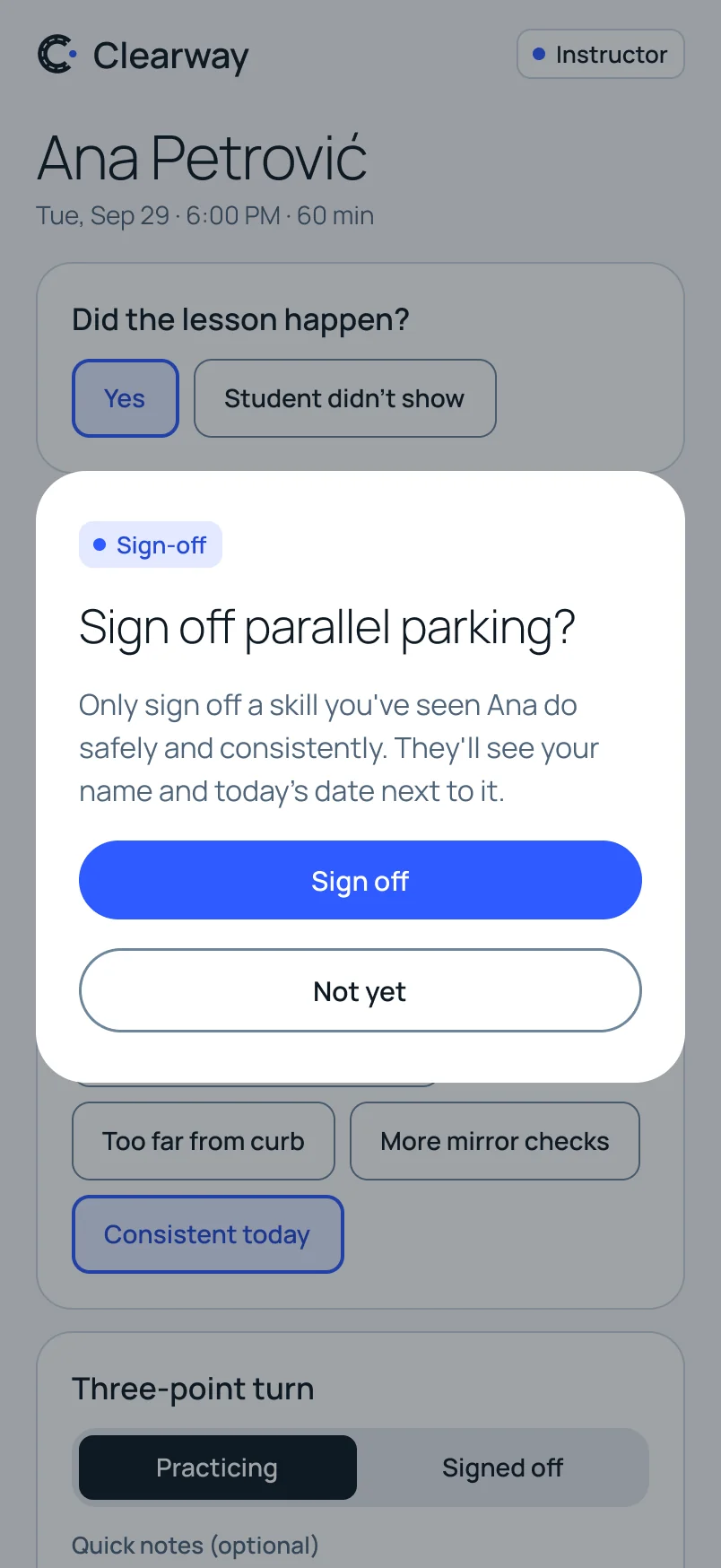
Signing off a skill asks for one confirmation, because it changes what the student sees. If a sign-off is ever reversed, the student sees that too, with a name and a date. Readiness never changes silently.
04How it sounds
The voice
Clearway speaks like a good clinic: clear, factual, unhurried.
I wrote the copy for every screen and state before I designed anything. It was the cheapest way to find out whether the product was honest, because pressure shows up in words first.
| Instead of | Clearway says |
|---|---|
| 5 of 7 road-test skills signed off | |
| Free to change until Mon, Sep 28, 6:00 PM | |
| 2 lessons left. Marcus’s estimate: 2–4 more. | |
| Marcus is booked | |
| Book |
The rules behind them are short. State, don’t cheer. Name who made every judgment. Put a number where a decision is. No urgency, no exclamation marks, and nothing on screen a colleague could read over your shoulder and learn something private.
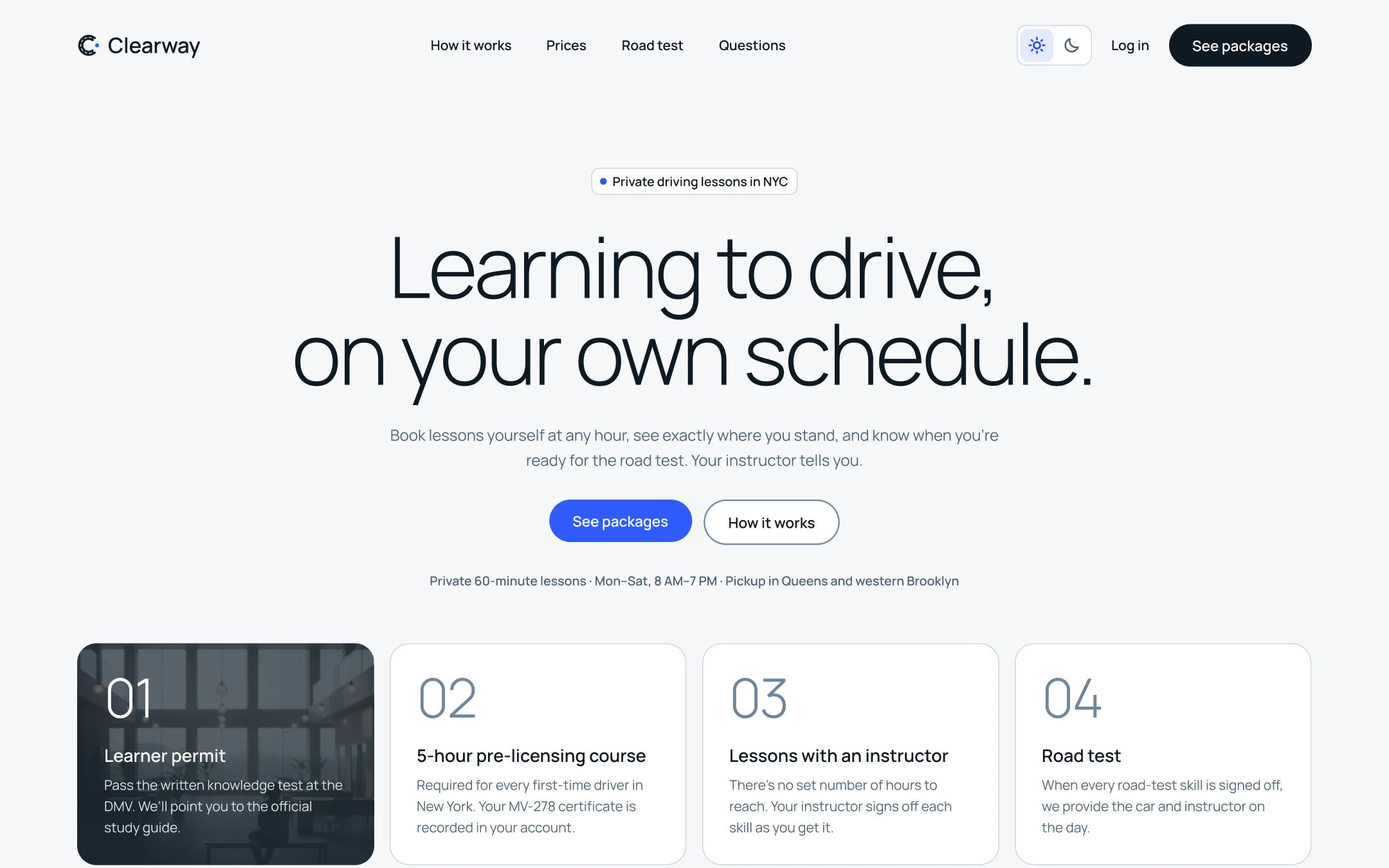
The landing page follows the same rules. It has no reviews and no statistics. It shows the booking page, the path and the readiness list, and lets them make the case.
From the landing page
“We won’t tell you you’re ready before you are, and we won’t sell you lessons you don’t need.”
05From one website to four platforms
The build
It started as a website. It needed to be in a pocket.
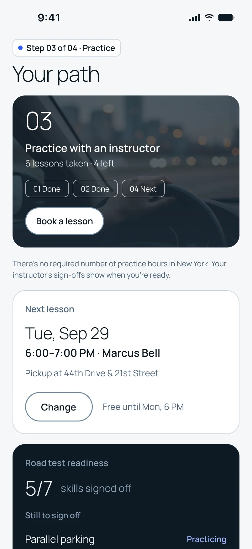
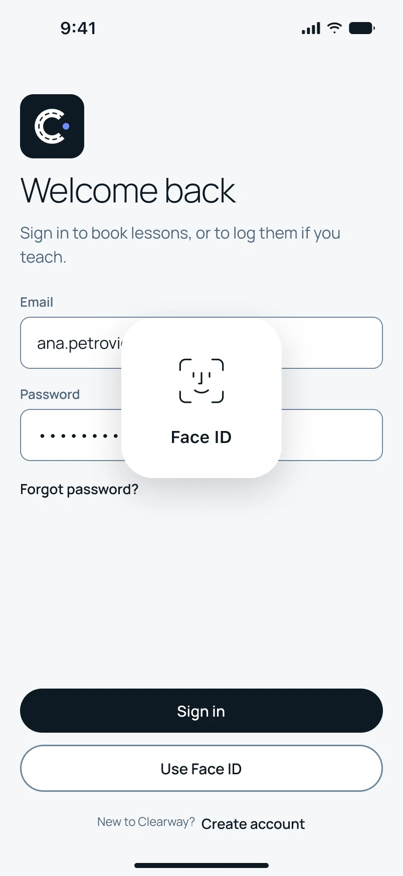
Lessons happen out of the house, and the reminder that matters arrives the evening before. So after the website I built the app, for iOS and Android. Students and instructors sign in to the same app and get different tabs.
I kept the structure and the words, and let each platform keep its own habits.
Signing in
Face ID on iOS and fingerprint or face on Android, through each system’s own prompt.
One reminder
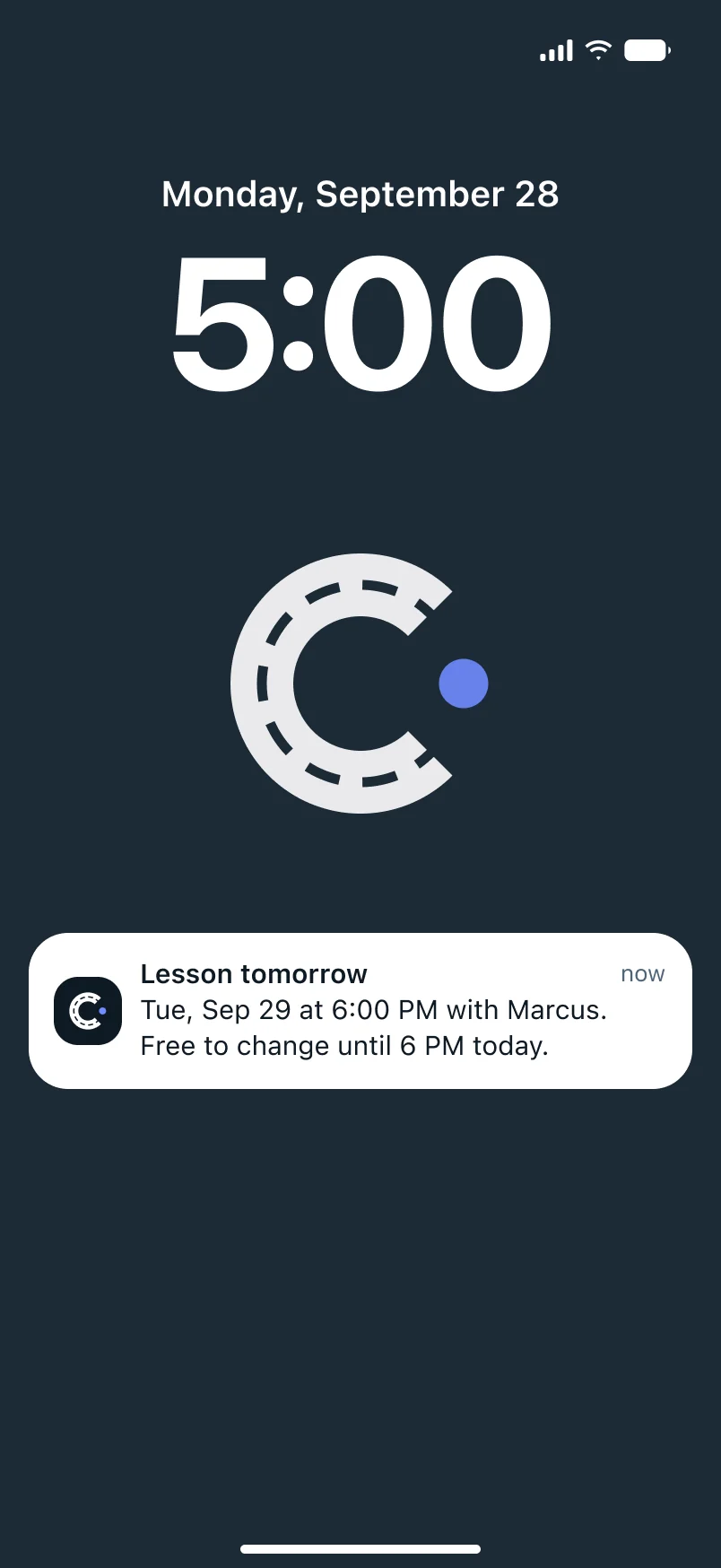
“Lesson tomorrow,” the evening before, for students and for instructors.
Native chrome
A Liquid Glass tab bar on iOS, a Material navigation bar on Android.
Sheets
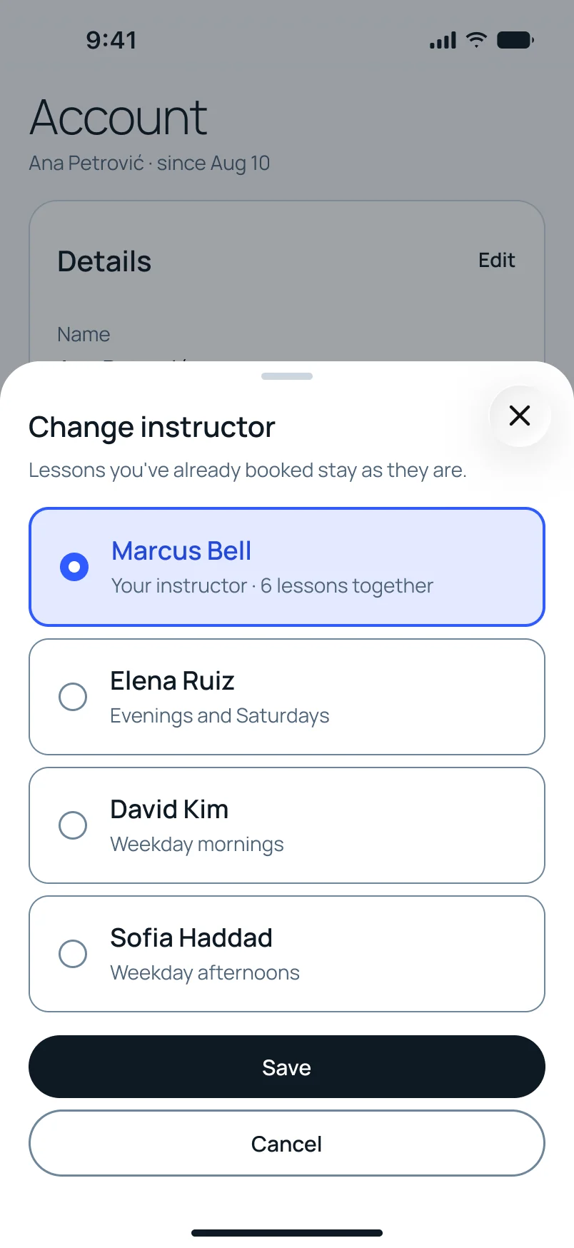
Side panels on desktop become bottom sheets on a phone.
The brand
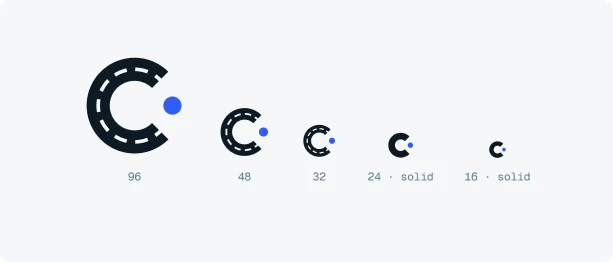
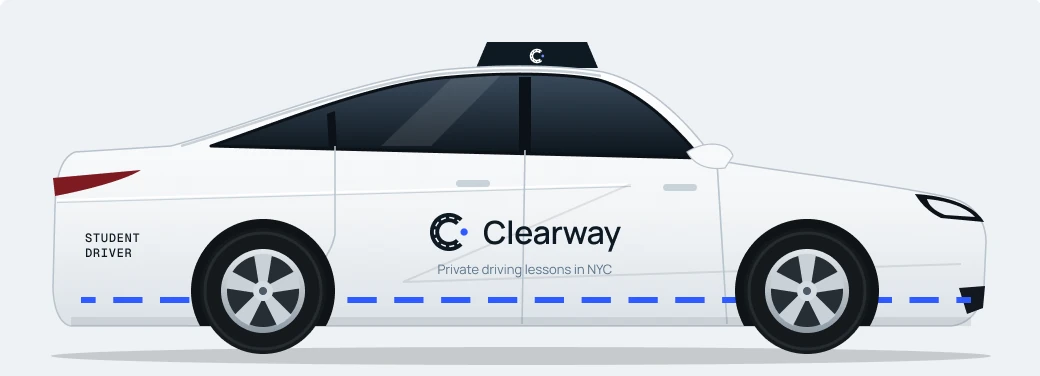
I designed the identity too: a C drawn as lane markings.
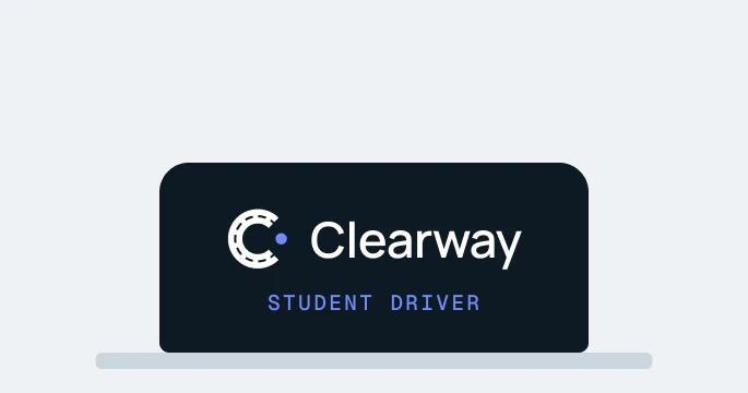
An invented school still needs a name on the car. The C is a lane line: evenly spaced dashes that read as road markings, with one blue dot. Below 24 px it switches to a solid C, so it still holds up in a browser tab and as an app icon.
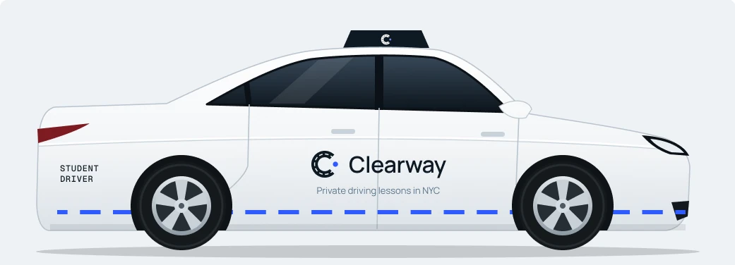
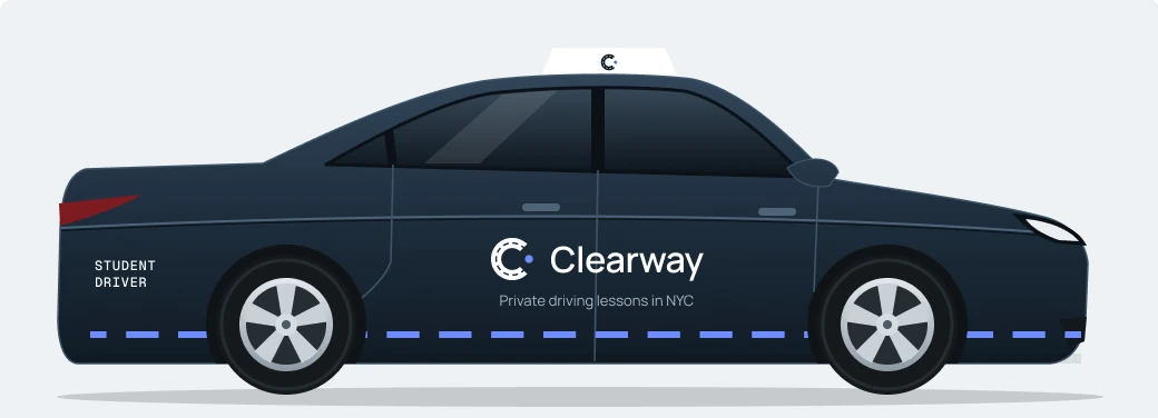
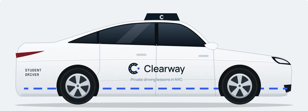
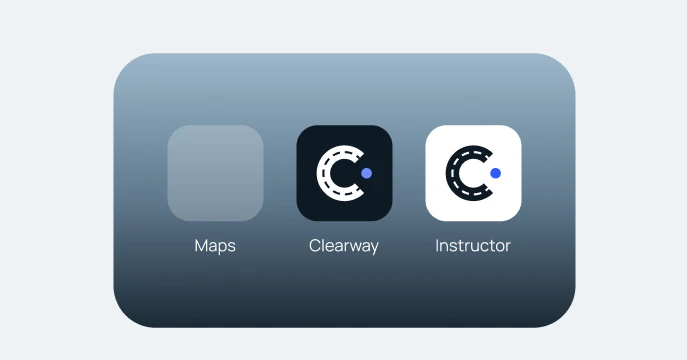
On the cars the same dashes run along the lower doors as a lane stripe. The roof sign sits on ink so it reads at night, and the app gets two icons: ink for students, white for instructors.
Light and dark
Light and dark.
On the website the switch sits next to Help, because for some people it’s an accessibility setting and not a preference.
Accessibility
I checked the whole file against WCAG, then fixed what failed.
The check found problems in places I thought were fine. Tertiary text and the toggle track were too light. Text on photos needed a stronger overlay. Some links and chips were too small to tap.
Contrast
The failing colors were fixed, and all 25 dark-mode pairs I checked pass.
Target size
Links and chips are at least 44pt on iOS and 48dp on Android.
Never color alone
Every status has text and a dot or icon. A struck-through time also says why.
Focus and hover
Desktop controls have both. Phone-only controls don’t pretend to have hover.
This was a design check, not a test with assistive technology. That’s still to do.
06The hardest part
The challenge
Four platforms, and it still had to feel like one product.
Designing one website was manageable. Carrying it to mobile web, iOS and Android was the hard part. Every screen raised the same question: what has to stay identical, and what should follow the platform?
- 1
Same structure, same words.
The order of information and every label stay the same on all four, so a student who books on a laptop recognizes the app right away.
- 2
Navigation follows the platform.
A Liquid Glass tab bar on iOS, a Material navigation bar on Android. Copying one onto the other would have looked consistent in Figma and wrong on the phone.
- 3
Panels become sheets.
A side panel works on a wide screen. On a phone the same content comes up from the bottom, where a thumb can reach it.
- 4
Touch isn’t a small desktop.
Targets are at least 44pt on iOS and 48dp on Android, and hover exists only where there’s a pointer.
The rule I settled on: the content never changes, the controls can.
Consistent doesn’t mean identical.
07What I’d test first
Next
Every decision here is still a hypothesis.
I believe in these choices, but I haven’t watched anyone use them. These are the first things I’d find out.
- Does “5 of 7” read as progress or as a verdict?I’d test the readiness page with five first-time drivers and ask what they think happens next.
- Does the late-change rule feel fair?Losing a lesson is the hardest moment in the product. I’d watch whether people understand it before they decide, not after.
- Can an instructor really log a lesson in thirty seconds?That number is my estimate. It needs a real instructor in a real car.
- Are the New York facts right?The road-test route, the accompanying-driver rule and the course requirement need checking against the DMV’s own pages.
- Does it work with a screen reader?Contrast and target sizes are checked. Reading order and labels aren’t.
I set out to redesign a website. I ended up building a brand.
The brief I gave myself was a better driving school website. By the end there was a name, a logo, a voice, the school cars and four platforms that all belong together.
That’s what I’d take forward. A brand like this is a foundation: whatever the school needs next, a new page, a new feature or a sign on the street, already has a starting point.