Case study 01 · Personal project · Jul – Aug 2026
Find it.Know it’s safe to buy.
An app and responsive website that helps grocery shoppers find products in-store, and understand whether they’re safe for their household.
Harbey
Overview
Two questions, one experience: where is the product, and is it safe for my household?
Results
- SUS score, from round 1 to round 2
- 66.5 → 75.0
- Tasks completed in round 2
- 30/30
- SUS for the safety-checking flow
- 79.2
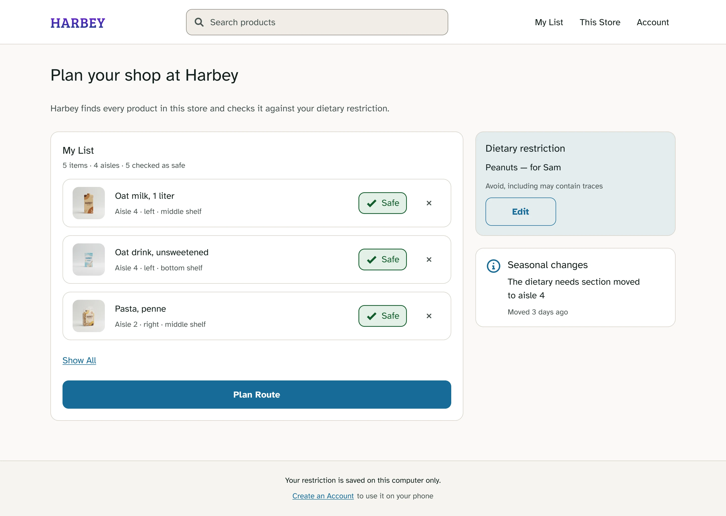
01The challenge
I started with one problem. Research showed me there were two.
My first idea was simple: help shoppers find products inside a grocery store. But interviews showed that finding something was only half of it. Once they found it, shoppers faced a second question: “Can I actually buy this?”
Find it
Help shoppers locate products without unnecessary walking around the store.
Check it
Help shoppers understand whether a product fits a dietary restriction they’ve saved.
Scope, on purpose: no cart, no checkout, no account.
02Research
Finding the product was only half the job.
I interviewed five shoppers of different ages, habits and familiarity with their store. My questions were about finding products, but three of the five independently described a second problem: even after finding a product, they still had to work out whether they could safely buy it. That changed the direction of the project.
- 01
Store layout
People lose time in stores they don’t know well, especially when sections have moved.
- 02
Product labels
Checking whether something is safe means reading small print: slow, and hard in a dim aisle.
- 03
Scattered products
Special-diet products appear in several places, so it’s hard to know you’re holding the right version.
- 04
Asking for help
Most wouldn’t ask staff. It feels like interrupting, and staff may not know the answer either.
“I needed tahini last week and walked past it three times.”
03Two users
Ananya and Amari needed almost opposite things.
Ananya
Age 42Has low vision and shops for a household member with a peanut allergy. For her, being wrong is not an option.
Success meansConfidence and accuracy, over speed
Amari
Age 23Eight months at the same store and still no clear mental map. A knee injury makes every extra lap costly.
Success meansFewer steps, first-attempt finds, shorter trips
There was no single definition of a “good” experience. What saved time for Amari couldn’t come at the expense of Ananya’s confidence.
04Competitors
Nobody connected both problems.
I ran Walmart, Kroger and Fig through the same six tasks. Each one solved finding or dietary checking, but none of them connected the two.
| Product | Find product | Dietary safety | Connected |
|---|---|---|---|
| Kroger | Yes | Yes | No |
| Walmart | Yes | No | No |
| Fig | No | Yes | No |
| Harbey | Yes | Yes | Yes |
05Information architecture
One vocabulary for one physical place.
Inside a store, a category and an aisle both point to the same thing: a physical location. So every location in Harbey is written the same way, everywhere.
- Aisle
- Side
- Shelf height
The same rule applies to safety: three possible answers, always in the same language and structure.
- Safe
- Not confirmed
- Not safe
Seven branches from Home in the app, including Scan, with one vocabulary throughout.
06From paper to screen
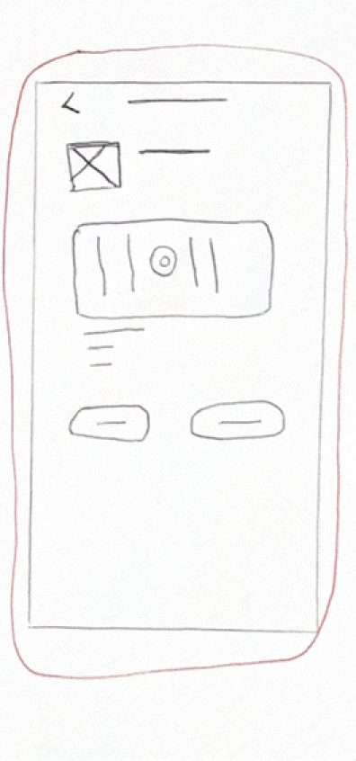
I started with sketches, not polished UI.
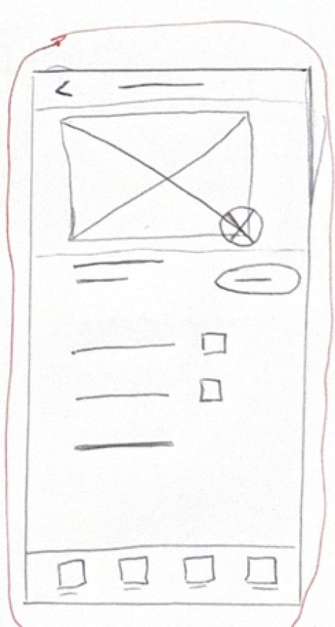
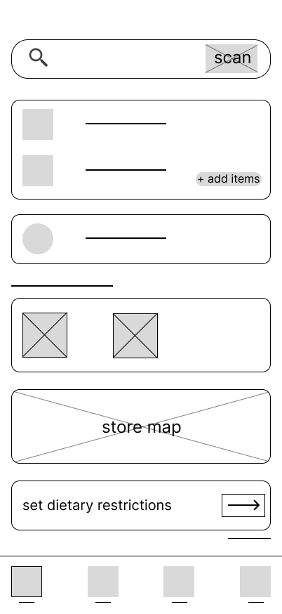
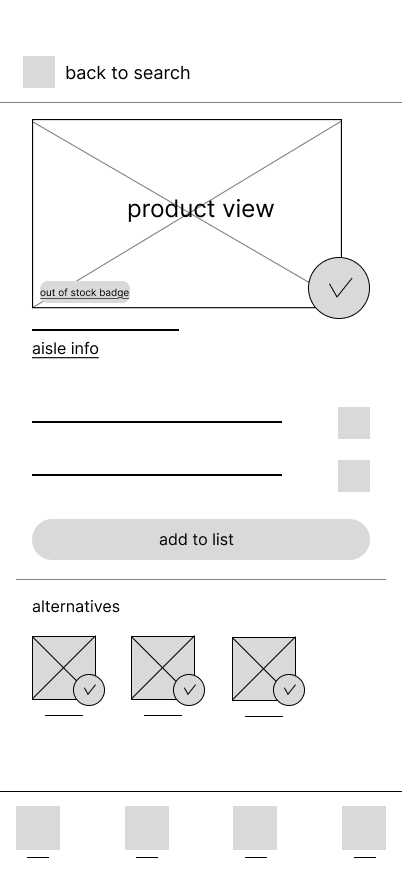
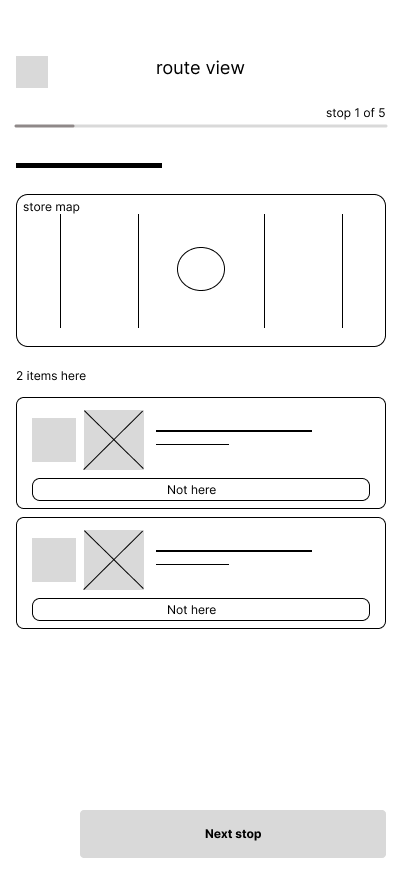
Paper let me explore the flows quickly. The strongest ideas moved into digital wireframes, and the first prototype covered the whole journey.
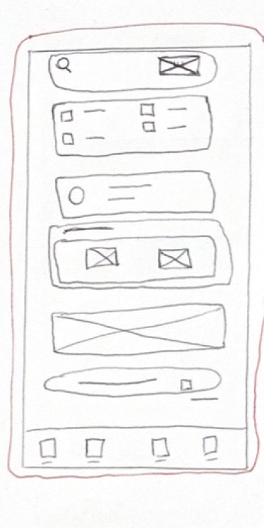
Search and scan share the header
They’re the two main ways into a product, so both stay reachable from the same place.
The shopping list stays on Home
The trip is visible the moment the app opens, instead of hiding behind another tab.
First prototype flow
- Set a restriction
- Search
- Check the answer
- Scan
- Find a safe alternative
07Testing · Round 1
Low fidelity
5 participants · 7 tasks
Unmoderated
- Tasks completed
- 33/35
- SUS score
- 66.5
- Observed errors
- 20
The completion rate looked encouraging. The behavior didn’t.
- 5/5acted on a safety answer without checking the evidence→ Added the information behind each answer
- 4/5couldn’t figure out how to start a shopping trip→ Added a clear starting action
- 3/5thought a route stop meant one item, not one aisle→ Restructured the route and added item counts
- 4/5struggled to choose between safe alternatives→ Gave each one an aisle, side, shelf height and distance
“Safe according to who, and when?”
08What changed
I made the answer explain itself.
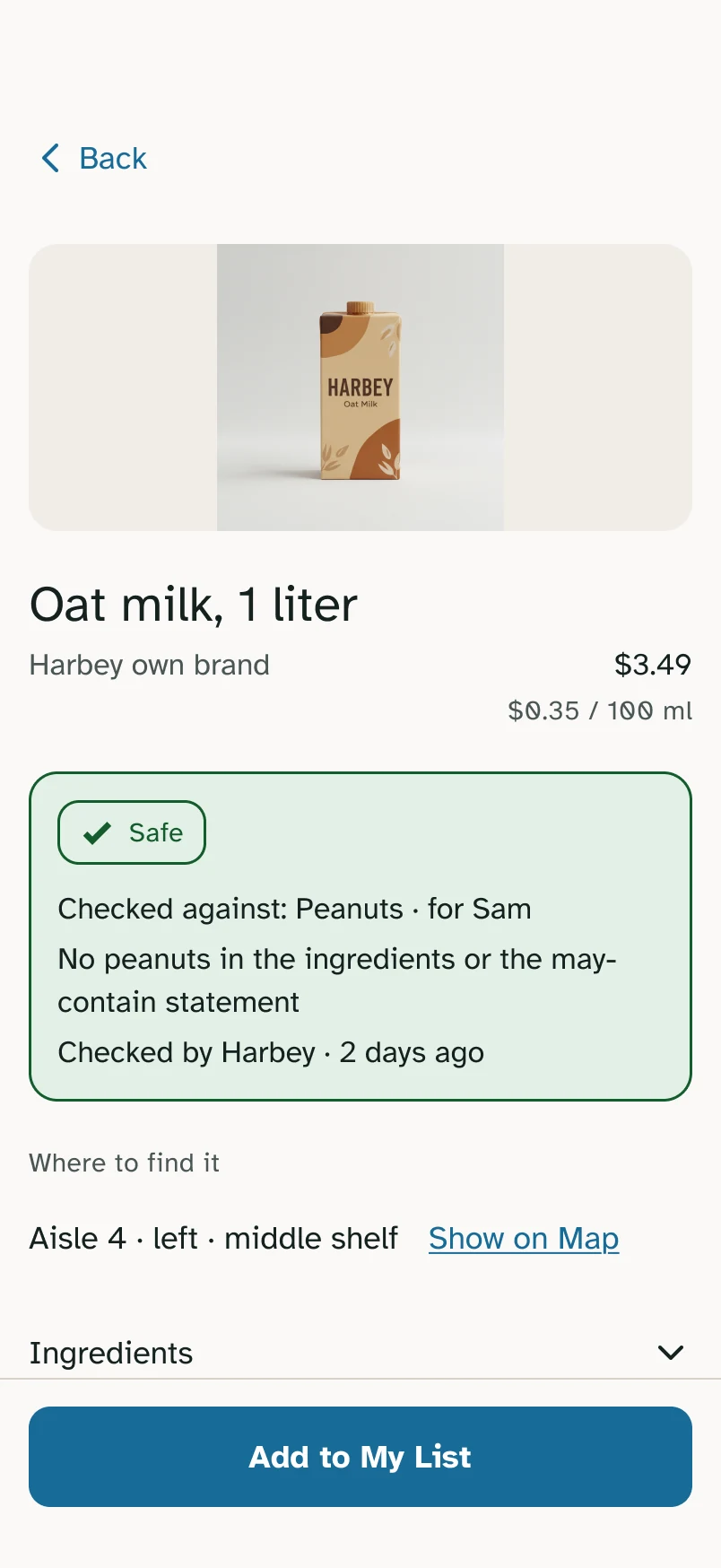
Instead of just “Safe,” every answer now shows:
- What was checked
- Which restriction was used
- Who it applies to
- How recently it was checked
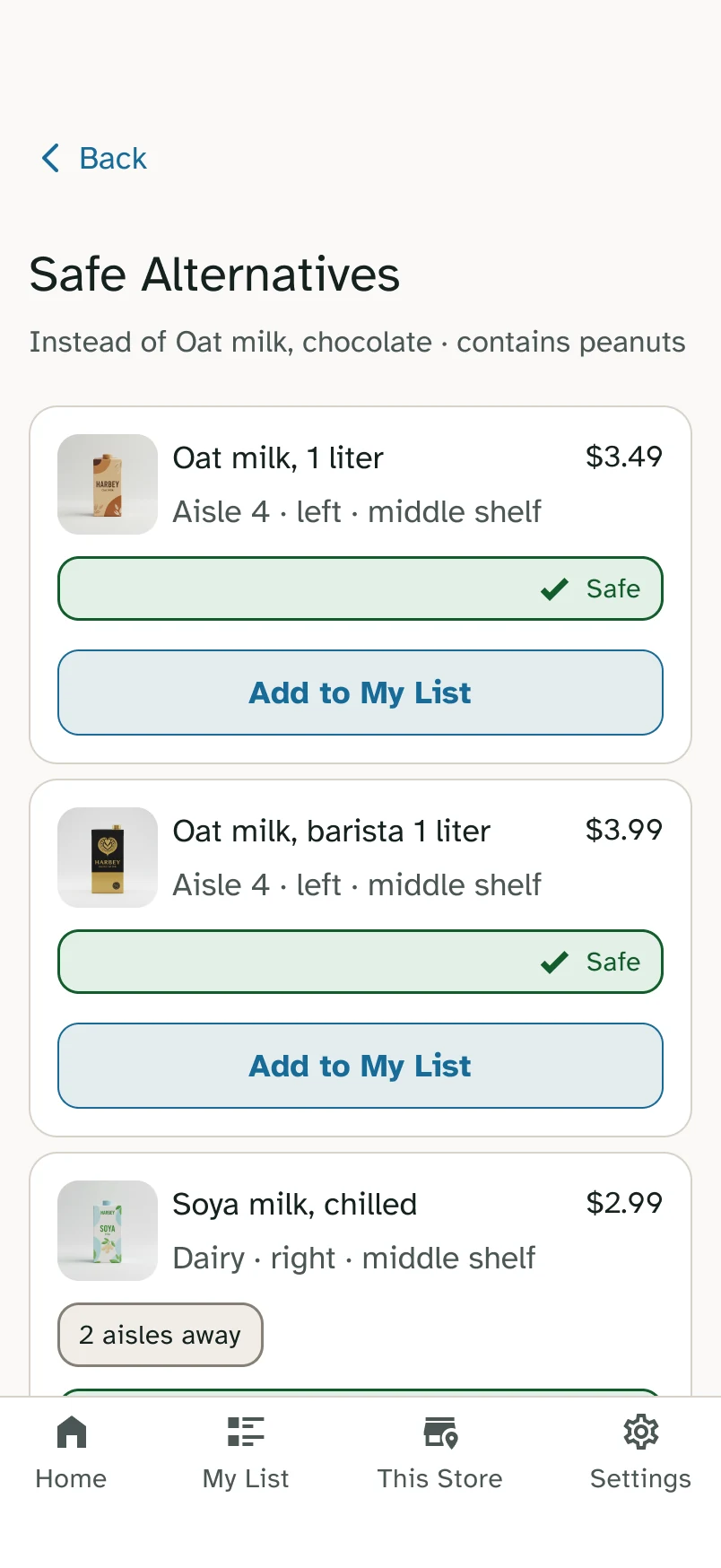
Alternatives became useful in the store too. Not “here is another safe product,” but “here is another safe product, and here’s where to find it.”
09Testing · Round 2
High fidelity
5 participants
3 checking products · 2 walking the route
- Tasks completed
- 30/30
- SUS average · 79.2 checking, 68.8 route
- 75.0
- Observed errors, 4 of them on one control
- 9
The flow I had rebuilt around safety scored comfortably higher. The route, which I had already fixed once, was still close to the benchmark, and testing showed why: both route testers pressed Start shopping trip, landed on a list instead of the route, and stopped.
“It gave me the same screen twice, so I assumed I had done it wrong.”
Button
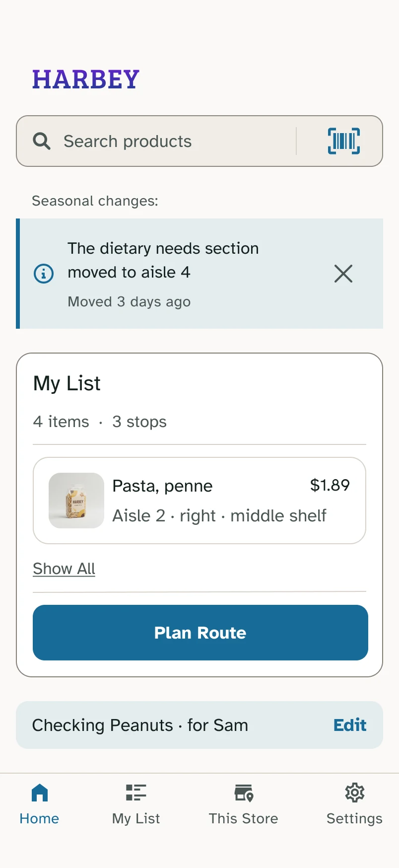
Was: Start shopping tripNow: Plan Route
The wording wasn’t the point. The button also had to actually open the route.
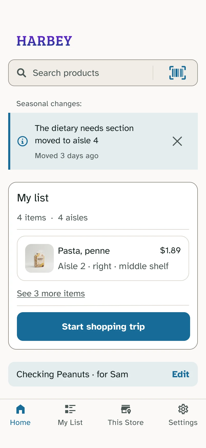
Trip card
Was: 5 items · 4 aislesNow: 5 items · 3 stops
The card now describes the trip, not the shopping list.
My first fix had addressed the finding, not the problem. A design fix is still a hypothesis until I test it.
10Safety answers
Every answer, one structure.
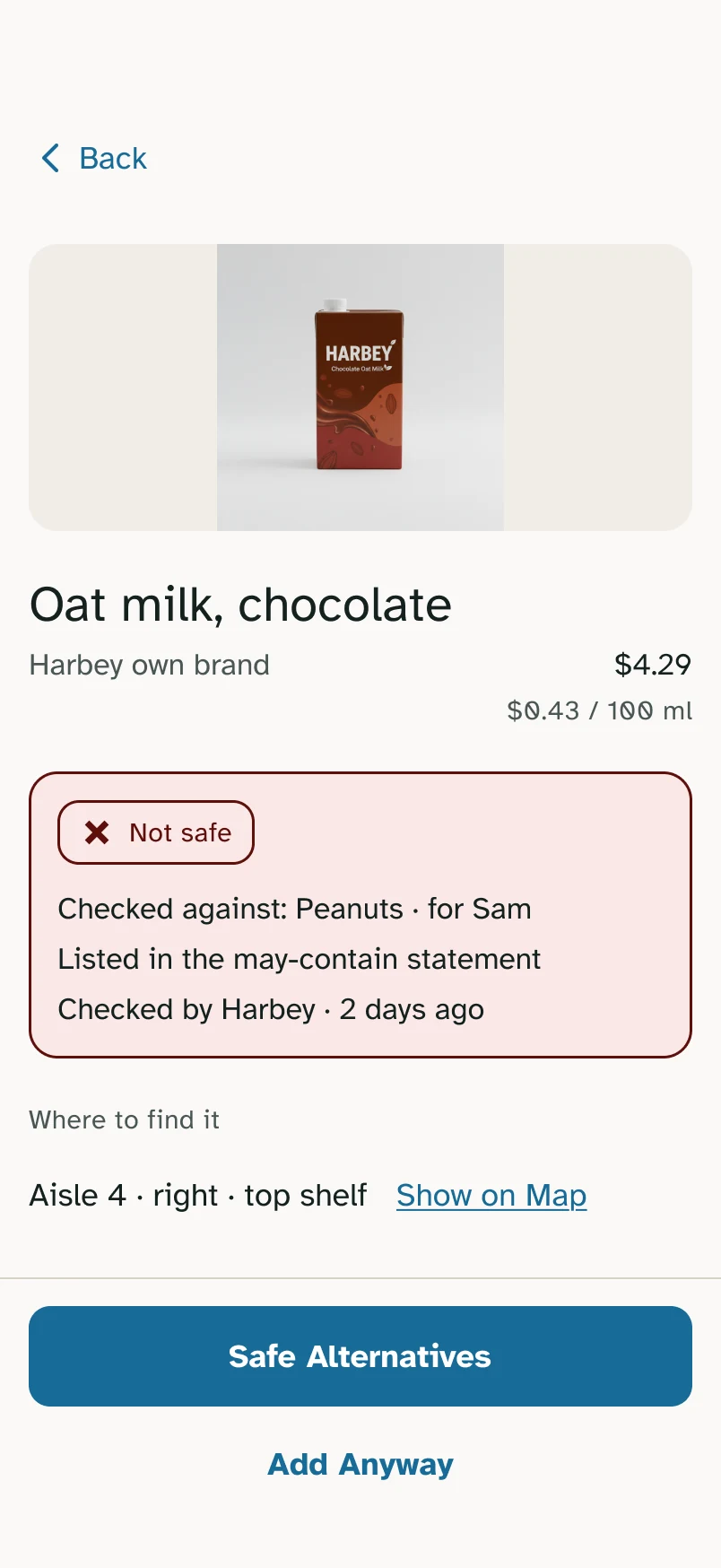
One participant couldn’t tell whether Harbey checked products differently depending on the result. So all three states now follow the same order, and name the source plainly.
- Allergen + who it’s for
- Sources
- Who checked it
Was: “Label information updated”Now: “Checked by Harbey”
11A small moment
The screen that changed a decision.
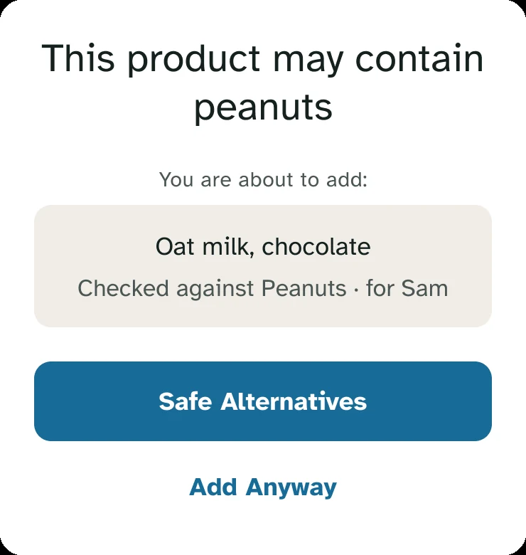
One tester was moving fast and went straight for Add it anyway on a product that wasn’t safe. At the confirmation step they stopped, read it, and backed out.
What changed their mind was that the message named the person the restriction applied to, not just the peanut. It was the clearest sign that the confirmation step was doing real work, not decoration.
12Accessibility
Accessibility changed what the product says, not just how it looks.
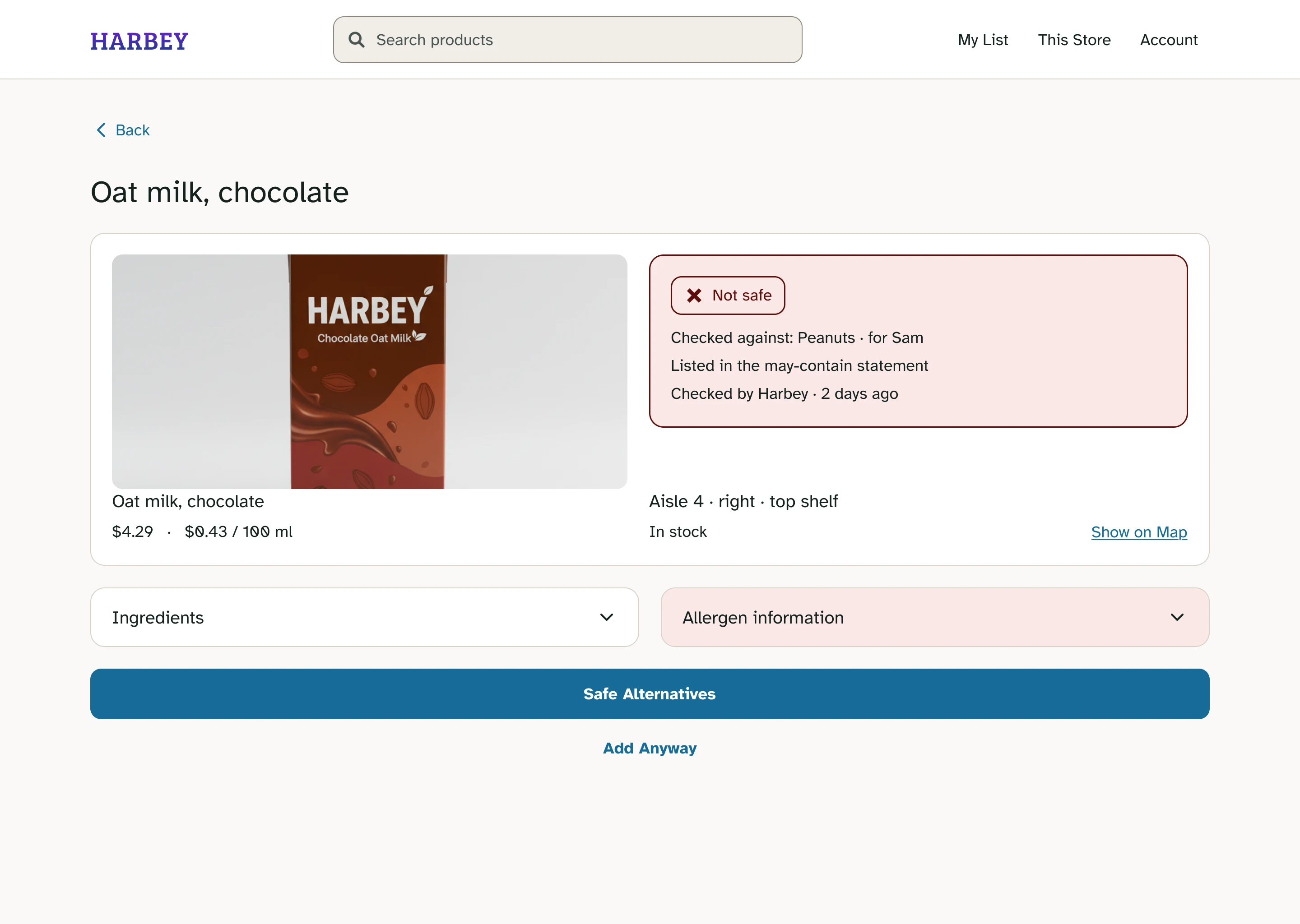
The most important accessibility decision wasn’t a font size or a color. It was writing every location as Aisle → Side → Shelf height, and giving every safety state text, an icon and a color, so meaning never depends on color alone.
Verdict
- Label
- “Not safe. Checked against peanuts for Sam.”
- Role
- Status message, announced on load
Read as text, never conveyed by color or icon alone.
Safe Alternatives
- Label
- “Safe Alternatives”
- Role
- Button
First action after the evidence, so the safe path comes before the override.
Add Anyway
- Label
- “Add Anyway. Opens a confirmation.”
- Role
- Button
Focus moves into the dialog; Escape closes it and focus returns here.
Allergen information
- Label
- “Allergen information, collapsed”
- Role
- Disclosure button
Announces expanded or collapsed, on focus and after activation.
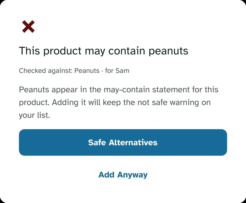
When a warning opens, the safe option gets focus first.
Dialog
- Label
- “This product may contain peanuts”
- Role
- Modal dialog
Focus is trapped inside. Escape closes and returns focus to Add Anyway. The heading is the dialog’s name.
Safe Alternatives
- Label
- “Safe Alternatives”
- Role
- Button, first in the dialog
Receives focus when the dialog opens, so the safe path is the default.
Add Anyway
- Label
- “Add Anyway. Adds a product that is not safe for Sam.”
- Role
- Button
The label states the consequence, since this is the only way past the warning.
I started out treating accessibility as something to apply to the interface. I finished understanding that it can change the content and the information architecture of a product.
13The website
Same experience, different context.
I kept the structure and vocabulary so people could move between app and website without relearning anything, but I didn’t just scale the mobile UI up. The website is less about walking the store and more about planning the trip before you arrive.
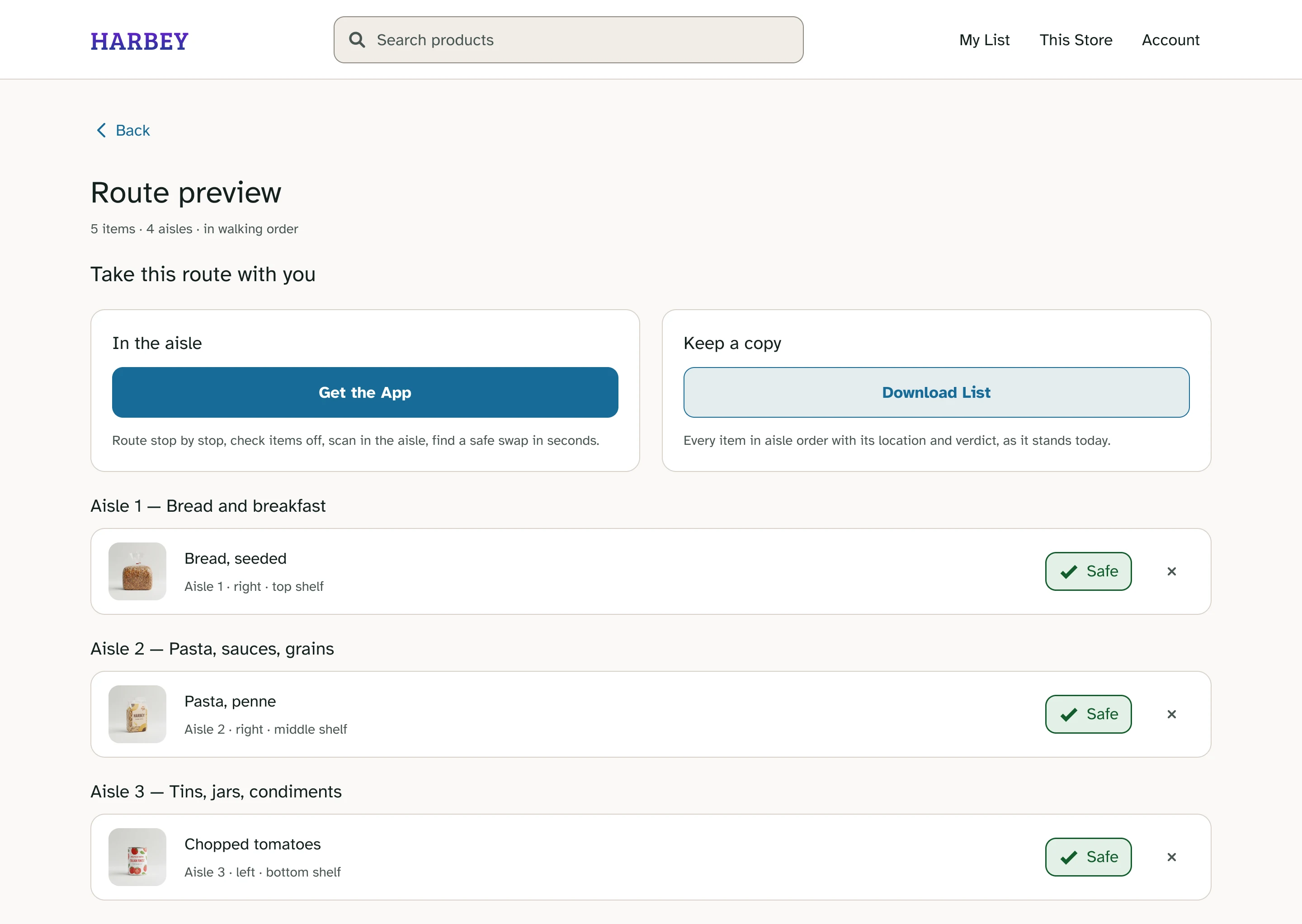
No scanner
Scanning makes sense with a phone in an aisle, not at a laptop.
No walking route
Send the route to your phone, or download the list grouped by aisle.
More space
Dietary restrictions get room to be shown in full.
14Outcome
The words did more work than I expected.
Both low-vision testers said Harbey gave them enough information to find products on their own. Neither of them used the map.
“Nobody has ever told me the shelf height before.”
15What I got wrong
The mistakes taught me more than the finished screens.
I trusted the wrong number
Round 1 hit 94% task completion and I almost moved on. Behavior, errors and ease told the real story.
I over-corrected
To stop the route losing track of items I added counts, then repeated them three times on one screen. One clear count would have done it.
I gave the map the best spot
It sat on top of every route stop. Neither low-vision tester touched it, and one scrolled past it every time. Moving it is first on my next iteration list.
“The picture I cannot use is sitting on top of the words I can.”
16What I learned
- 01Define success before designingSpeed isn’t always the metric. Ananya and Amari needed different things.
- 02Don’t let one metric tell the story94% completion looked like success. The behavior behind it said otherwise.
- 03Retest your own solutionsA fix isn’t done because it looks right in Figma. The route entry proved it.
- 04Accessibility starts with informationAisle, side and shelf height made Harbey more accessible, and more useful for everyone.
Next steps
Screen reader testing
Both low-vision testers used magnification. The annotations still need validating in a real build.
Understanding “Not confirmed”
Neither study produced this state. How do people read uncertainty, and what do they expect to do?
Completing the journey
Today it’s Find → Check. Next: Find → Check → Collect → Buy.
I thought I was designing a better way to find groceries. I finished it thinking about confidence.
Good UX isn’t getting the interface right the first time. It’s making something, finding where it breaks, understanding why, and being willing to change it.